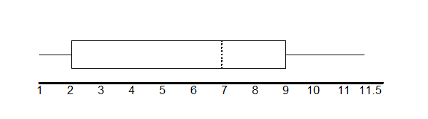
The two whiskers extend from the first quartile to the smallest value and from the third quartile to the largest value. The median is shown with a dashed line.
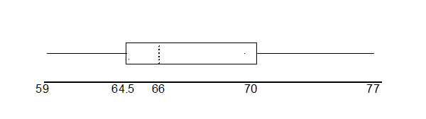
The following data are the heights of 40 students in a statistics class.
59
60
61
62
62
63
63
64
64
64
65
65
65
65
65
65
65
65
65
66
66
67
67
68
68
69
70
70
70
70
70
71
71
72
72
73
74
74
75
77
Construct a box plot:
Using the ti-83, 83+, 84, 84+ calculator
Enter data into the list editor (Press STAT 1:EDIT). If you need to clear the list, arrow up to the name L1, press CLEAR, arrow down.
Put the data values in list L1.
Press STAT and arrow to CALC. Press 1:1-VarStats. Enter L1.
Press ENTER
Use the down and up arrow keys to scroll.
Smallest value = 59
Largest value = 77
Q1: First quartile = 64.5
Q2: Second quartile or median= 66
Q3: Third quartile = 70
Using the ti-83, 83+, 84, 84+ to construct the box plot
Go to 14:Appendix for Notes for the TI-83, 83+, 84, 84+ Calculator.
To create the box plot:
Press Y=. If there are any equations, press CLEAR to clear them.
Press 2nd Y=.
Press 4:Plotsoff. Press ENTER
Press 2nd Y=
Press 1:Plot1. Press ENTER.
Arrow down and then use the right arrow key to go to the 5th picture which is the box plot. Press ENTER.
Arrow down to Xlist: Press 2nd 1 for L1
Arrow down to Freq: Press ALPHA. Press 1.
Press ZOOM. Press 9:ZoomStat.
Press TRACE and use the arrow keys to examine the box plot.
Each quarter has 25% of the data.
The spreads of the four quarters are 64.5 - 59 = 5.5 (first quarter), 66 - 64.5 = 1.5 (second quarter), 70 - 66 = 4 (3rd quarter), and 77 - 70 = 7 (fourth quarter). So, the second quarter has the smallest spread and the fourth quarter has the largest spread.
Interquartile Range:
.
The interval 59 through 65 has more than 25% of the data so it has more data in it than the interval 66 through 70 which has 25% of the data.
The middle 50% (middle half) of the data has a range of 5.5 inches.
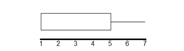
For some sets of data, some of the largest value, smallest value, first quartile, median, and third quartile may be the same. For instance, you might have a data set in which the median and the third quartile are the same. In this case, the diagram would not have a dotted line inside the box displaying the median. The right side of the box would display both the third quartile and the median. For example, if the smallest value and the first quartile were both 1, the median and the third quartile were both 5, and the largest value was 7, the box plot would look as follows:
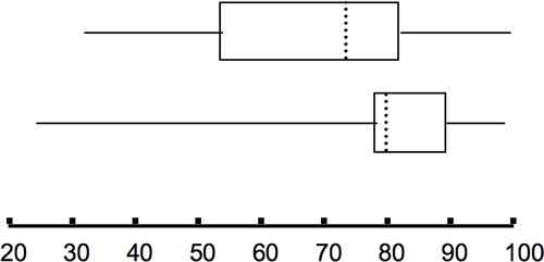
Test scores for a college statistics class held during the day are:
99
56
78
55.5
32
90
80
81
56
59
45
77
84.5
84
70
72
68
32
79
90
Test scores for a college statistics class held during the evening are:
98
78
68
83
81
89
88
76
65
45
98
90
80
84.5
85
79
78
98
90
79
81
25.5
What are the smallest and largest data values for each data set?
What is the median, the first quartile, and the third quartile for each data set?
Create a boxplot for each set of data.
Which boxplot has the widest spread for the middle 50% of the data (the data between
the first and third quartiles)? What does this mean for that set of data in comparison to the other set of data?
For each data set, what percent of the data is between the smallest value and the first quartile? (Answer: 25%) the first quartile and the median? (Answer: 25%) the median and the third quartile? the third quartile and the largest value? What percent of the data is between the first quartile and the largest value? (Answer: 75%)
First data set
Second data set
The first data set (the top box plot) has the widest spread for the middle 50% of the data.
is
for the first data set and
for the second data set. So, the first set of data has its middle 50% of scores more spread out.
25% of the data is between
and
and 25% is between
and
.
Receive real-time job alerts and never miss the right job again
Source:
OpenStax, Collaborative statistics using spreadsheets. OpenStax CNX. Jan 05, 2016 Download for free at http://legacy.cnx.org/content/col11521/1.23
Google Play and the Google Play logo are trademarks of Google Inc.
Notification Switch
Would you like to follow the 'Collaborative statistics using spreadsheets' conversation and receive update notifications?