

| << Chapter < Page | Chapter >> Page > |
There are two main types of graphics you may want to use in your course:
1) a banner and
2) those that help to illustrate points in the content of your lessons.
Banner
A banner is an image that can appear on your course opening page. A banner can:
For example, here is a sample banner created by Distance Education.
You may not think a visual cue such as a banner is valuable, but think what it would be like if all of our road signs looked exactly alike. From a distance you recognize immediately from both the shape and color of a sign what's coming up in the roadway. If stops, yields, and other signals were placed on signs of exactly the same shape and colors, you would not be able to determine what was required of you as quickly! Think of your course banner as a roadsign for your course.
Illustrative Graphics
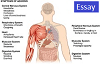
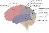
The second type of graphics you will probably use in your course are illustrative. Occasionally you will find it necessary to demonstrate points both visually as well as verbally. Illustrations, graphs, maps, diagrams, and photographs are among the kinds of illustrative matter you can use to help students understand important points in your lessons.
When Not to Use Illustrative Graphics
Do not use graphics for the sole purpose of putting an image on the page. Some pages of your lesson don't need them, and your students will be confused to see an image that doesn't bear any relationship with the content (unless it's part of the design template). So, use common sense and be purposeful with your image choices. If an image is the best way to get a point across, then it's a good idea to put it in the lesson.
Rules of Thumb
When looking for illustrative graphics, be sure that you:
Dr. Ruth Clark uses empirical evidence to discuss the impact of visuals on learning in her book e-Learning and the Science of Instruction . While relevant visuals can improve learning up to 90%, ineffective visuals often serve no useful instructional purpose and can actually impair learning. So, extraneous, decorative graphics should be avoided, even if the graphic is interesting to look at.
Two research based scenarios regarding graphics that Dr. Clark recommends do improve learning are:
Multimedia Principle - use words and graphics rather than words alone. Based on cognitive theory and research, including relevant, related written or spoken text and explanative graphics will promote learning. (Clark, p. 51)
Contiguity Principle - Place corresponding words and graphics near each other. When applying the Multimedia Principle, have as little physical separation between the text and the graphic as possible. (Clark, p. 67)
Notification Switch
Would you like to follow the 'Visual design for distance education content' conversation and receive update notifications?
|
|

|
|

|
|

|
|
|
|
|

|
|

|
|

|
|
|
|

|