

| << Chapter < Page | Chapter >> Page > |
At your computer, try this exercise: (1) Open the file, Statistics First Day of Class Survey that you worked on previously (2) create a new worksheet tab and label it Frequency Distributions Categorical Data, and another worksheet tab and label it Frequency distributions Quantitative Data; (3) open the file in Google Spreadsheet or Excel; (4) pick a column of data that is categorical and has been “cleaned” and create a countif frequency chart with all the appropriate labels for rows and columns. And (5) save the file again and post in the appropriate Moodle assignment.
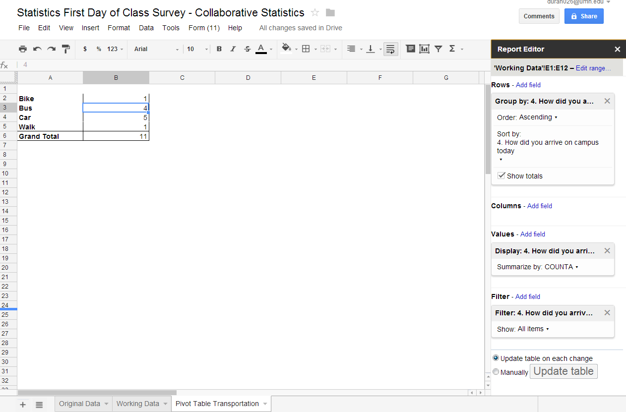
An alternate process for creating a frequency, relative frequency, and commulative relative frequency chart can be achieved by using a pivot chart or pivot table. A pivot table is a data visualization and summarization tool found in most spreadsheets. It is a quick way to create tables, either horizontal or vertical thereby a “pivot table”. We will use pivot tables particularly when we look at bi-variate data, since we will want to summarize data taking in account the contributions of two variables. For right now we are only interested in summarizing one variable so the directions are simplified.
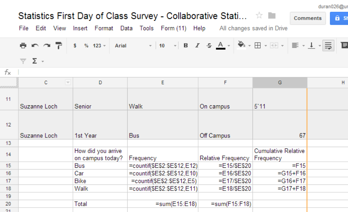
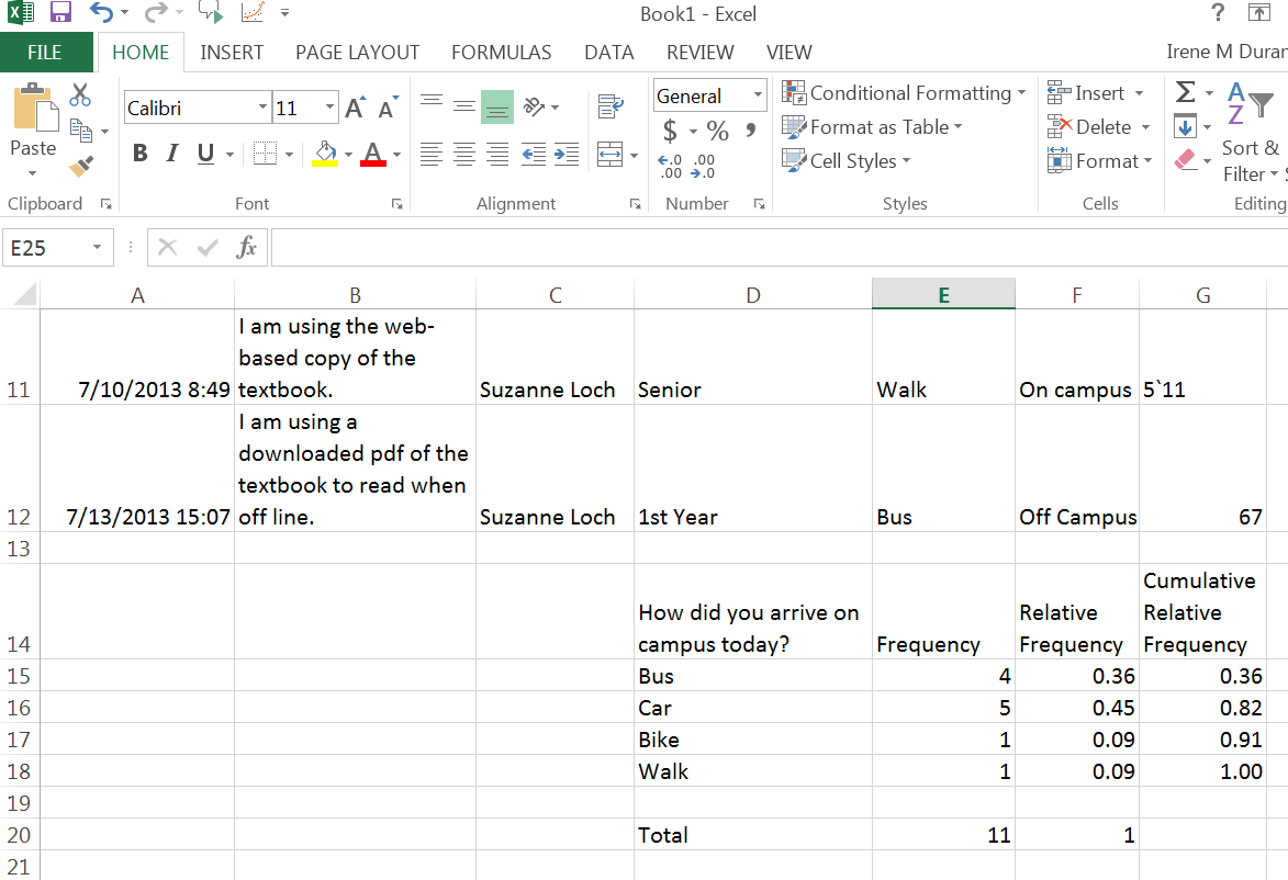
One can create a pivot chart or table to display frequency, relative frequency, and cumulative relative frequency. When using the pivot function in Google or Excel, one only has to select the column one wants to summarize and then decide “how” the data will be presented. We will create a pivot table using the same column of data, “How did you arrive on campus today?” We will present a pivot table in Google Spreadsheet first and then in Excel.
Google Spreadsheet: To create a pivot table in Google Spreadsheet, you will need to (1) highlight the column of data that you would like to display in a pivot table, select the Pivot Table report from the “Data” tab on the ribbon. Once you select Pivot Table report it automatically creates a Pivot Table worksheet. You can rename that tab to be more descriptive if you choose. In the new sheet you will see “Report Editor” on the right hand side of your spreadsheet. You will want to select Working Data, rows, columns, values and filter fields. To edit “Working Data be sure to know your data addresses (beginning row and column to the last row and column). For this example, the data is from E1 to E12 so I will edit the Working Data to reflect that range. The row field is the categories that you will want in your pivot table rows. You have only one choice since you only highlighted one column before selecting Pivot Table report. Your choices are then the pick order of the categories (ascending or descending alphabet) and then check the box to “show totals”. We are only creating a pivot table with one variable so you will not be adding columns. When we look at bivariable date, we will also pick columns. Since you only selected one column, and you used that data to create rows you will have no pull down menu here. Next you will select “values add field”, again you will only have one choice from the pull down menu, “How did you arrive on campus today?”. You will have a choice of how you want the data summarized. Since you have words, you will select counta, if you had “numbers” you would select “count”, The next field is filter. If you had a field that you would like to suppress you could choose that field. For example, if you didn’t want to display bike since it only occurred once you could “filter” out bike. By selecting bike, your pivot table now only has bus, car, walk and total. You also have a choice at the end to manually update the pivot table or select update table on each change. If you pick update the pivot table on each change if you go back to your working data and change a cell, the change will be reflected in the pivot table. Try it. With Google Spreadsheet you will need to create your own column titles and create your relative frequency and cumulative relative frequency as directed in the previous section, creating two more columns and adding in the formulas using cell addresses.
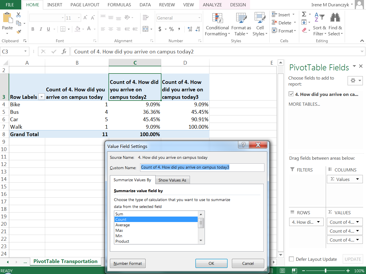
Excel spreadsheet: Excel is quite similar but will have some additional advantages. Let’s walk through it step by step. The first step is the same as with Google Spreadsheet, highlight the column of data you want to use to create a pivot table. Next go to the “INSERT” tab next to your home tab, the first choice in the “INSERT” menu will be “Pivot Table” Place you mouse over pivot table and left click. A dialogue box will appear. The first field will again be the range of data. In this case it is E1:E12, with the absolute reference dollar sign with the cell address. Next you will have a choice to display the Pivot Table report in the existing worksheet or a new worksheet. For this example select “new worksheet” Then left click on the “OK” button. A new worksheet will appear. You have the same fields that Google Spreadsheet had but it is laid out differently. You will want to select your question from the “choose fields to add to report” by moving your mouse over the statement and left clicking. Horizontal and vertical line with double arrows will appear. Holding your left click over the question, you can drag-and-drop the question to the “rows” section of the PivotTable Fields (bottom right box). Note that when you do this the fields of that column appear on the spreadsheet. Next you will go back to the “Choose fields to add to report” and select the question again and drag-and-drop to the “values” section (bottom right field). Note now that you have your count for each of the categories related to your question. If you select the question two more times and add it to the “values” field we will be able to create the relative frequency and cumulative relative frequency column to your pivot table. Note that in the Value field, you have a down arrow for each of the three entries. The first entry we will keep as count. For the second entry we will click on the down arrow and when the “Value Field Settings” appears in the drop down menu you will select “value field settings.” A pop up menu will appear. This pop up menu will have two tabs. Select “show values as” (a new tab), use the pull down menu arrow next to “no calculation” and pick % of column total. When you complete this action, the relative frequency will be in the third column. In you final Values field entry click on the down arrow and when the “Value Field Settings” appears in the drop down menu you will select “value field settings.” A pop up menu will appear again. This time pick “% running total in”.in the “show values as” pull down menu. You have now completed your frequency, relative frequency, and cumulative relative frequency table. See the screenshots below for a visual representation of these steps for Google and Excel. I have cleaned up the Excel screen a bit by wrapping text in the title boxes and in both Excel and Google I have added descriptive worksheet titles.
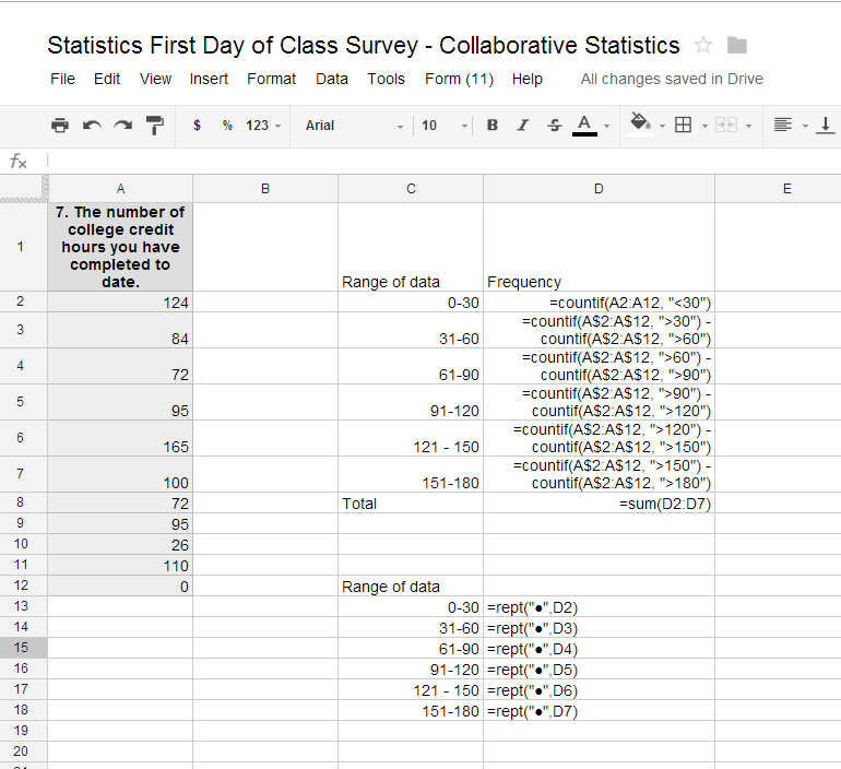
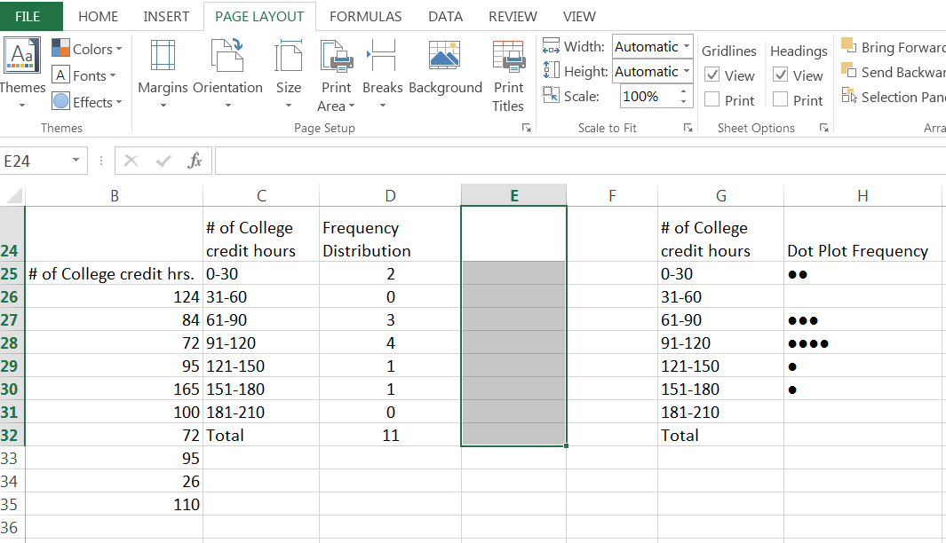
One can create a frequency distribution for quantitative data using the above techniques. One will need to create categories for the frequency distribution. In the next chapter we will discuss processes for creating these categories. In this chapter you will just be counting the data that fits the criteria listed. So using the countif principles with criteria for the groups (=countif(cell range, criteria) or such as =COUNTIF(H1:H12, "<=30") for counting all the students who have 30 or less credit hours, then =COUNTIF(H$1:H$12, ">30") - COUNTIF(H$1:H$12, ">60") to count all the student who have 31 to 60 credit hours, etc. Note that the criteria follows the cell addresses. There is a comma between the cell range and the criteria. The criteria are encapsulated in quotation marks.
At your computer, try this exercise: (1) Open the file, Statistics First Day of Class Survey that you worked on previously; (2) open the file in Google Spreadsheet or Excel; (3) Go to your tab labeled Frequency Distributions Quantitative Data; (4) pick column of data that is quantitative and has been “cleaned” and create a countif frequency chart with all the appropriate labels for rows and columns. And (5) save the file again and post in the appropriate Moodle assignment.
A horizontal dot plot can be created by using your frequency table and creating one more column and using the repetition formula =REPT(“criteria”, count) so if you want to create a dot plot you will repeat ● and you can use the count in your frequency column. If I was doing the frequency for the number of credit hours completed the formula would be ‘Rept(“●”, d25). I would then copy and paste this formula down to the end of my frequencies. And end up with the picture below. To find the ●symbol, go to the insert tab on your ribbon. Pick symbol from the most right block on the insert tab ribbon. Click on the down arrow for symbols. Pick more symbols. Under the recently used symbols you will find a box for character code. Enter the character code 25cf for a black dot. We will use a wide dot for other graphs and its character code is 25cb
Notification Switch
Would you like to follow the 'Collaborative statistics using spreadsheets' conversation and receive update notifications?

|
|

|
|

|
|

|
|

|
|

|
|

|
|

|
|

|
|

|