<< Chapter < Page Chapter >> Page >

Go to [link] . There are calculator instructions for entering data and for creating a customized histogram. Create the histogram for [link] .

  • Press Y=. Press CLEAR to delete any equations.
  • Press STAT 1:EDIT. If L1 has data in it, arrow up into the name L1, press CLEAR and then arrow down. If necessary, do the same for L2.
  • Into L1, enter 1, 2, 3, 4, 5, 6.
  • Into L2, enter 11, 10, 16, 6, 5, 2.
  • Press WINDOW. Set Xmin = .5, Xscl = (6.5 – .5)/6, Ymin = –1, Ymax = 20, Yscl = 1, Xres = 1.
  • Press 2 nd Y=. Start by pressing 4:Plotsoff ENTER.
  • Press 2 nd Y=. Press 1:Plot1. Press ENTER. Arrow down to TYPE. Arrow to the 3 rd picture (histogram). Press ENTER.
  • Arrow down to Xlist: Enter L1 (2 nd 1). Arrow down to Freq. Enter L2 (2 nd 2).
  • Press GRAPH.
  • Use the TRACE key and the arrow keys to examine the histogram.

Try it

The following data are the number of sports played by 50 student athletes. The number of sports is discrete data since sports are counted.

1; 1; 1; 1; 1; 1; 1; 1; 1; 1; 1; 1; 1; 1; 1; 1; 1; 1; 1; 1
2; 2; 2; 2; 2; 2; 2; 2; 2; 2; 2; 2; 2; 2; 2; 2; 2; 2; 2; 2; 2; 2
3; 3; 3; 3; 3; 3; 3; 3
20 student athletes play one sport. 22 student athletes play two sports. Eight student athletes play three sports.

Fill in the blanks for the following sentence. Since the data consist of the numbers 1, 2, 3, and the starting point is 0.5, a width of one places the 1 in the middle of the interval 0.5 to _____, the 2 in the middle of the interval from _____ to _____, and the 3 in the middle of the interval from _____ to _____.

1.5
1.5 to 2.5
2.5 to 3.5

Got questions? Get instant answers now!

Using this data set, construct a histogram.

Number of Hours My Classmates Spent Playing Video Games on Weekends
9.95 10 2.25 16.75 0
19.5 22.5 7.5 15 12.75
5.5 11 10 20.75 17.5
23 21.9 24 23.75 18
20 15 22.9 18.8 20.5
This is a histogram that matches the supplied data. The x-axis consists of 5 bars in intervals of 5 from 0 to 25. The y-axis is marked in increments of 1 from 0 to 10. The x-axis shows the number of hours spent playing video games on the weekends, and the y-axis shows the number of students.

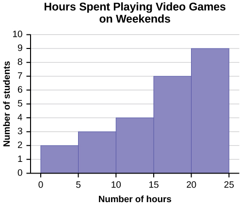
Some values in this data set fall on boundaries for the class intervals. A value is counted in a class interval if it falls on the left boundary, but not if it falls on the right boundary. Different researchers may set up histograms for the same data in different ways. There is more than one correct way to set up a histogram.

Got questions? Get instant answers now!

Try it

The following data represent the number of employees at various restaurants in New York City. Using this data, create a histogram.

  • 22
  • 35
  • 15
  • 26
  • 40
  • 28
  • 18
  • 20
  • 25
  • 34
  • 39
  • 42
  • 24
  • 22
  • 19
  • 27
  • 22
  • 34
  • 40
  • 20
  • 38
  • and 28

Use 10–19 as the first interval.

Got questions? Get instant answers now!

Count the money (bills and change) in your pocket or purse. Your instructor will record the amounts. As a class, construct a histogram displaying the data. Discuss how many intervals you think is appropriate. You may want to experiment with the number of intervals.

Frequency polygons

Frequency polygons are analogous to line graphs, and just as line graphs make continuous data visually easy to interpret, so too do frequency polygons.

To construct a frequency polygon, first examine the data and decide on the number of intervals, or class intervals, to use on the x -axis and y -axis. After choosing the appropriate ranges, begin plotting the data points. After all the points are plotted, draw line segments to connect them.

A frequency polygon was constructed from the frequency table below.

Frequency Distribution for Calculus Final Test Scores
Lower Bound Upper Bound Frequency Cumulative Frequency
49.5 59.5 5 5
59.5 69.5 10 15
69.5 79.5 30 45
79.5 89.5 40 85
89.5 99.5 15 100
A frequency polygon was constructed from the frequency table below.

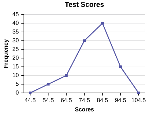
The first label on the x -axis is 44.5. This represents an interval extending from 39.5 to 49.5. Since the lowest test score is 54.5, this interval is used only to allow the graph to touch the x -axis. The point labeled 54.5 represents the next interval, or the first “real” interval from the table, and contains five scores. This reasoning is followed for each of the remaining intervals with the point 104.5 representing the interval from 99.5 to 109.5. Again, this interval contains no data and is only used so that the graph will touch the x -axis. Looking at the graph, we say that this distribution is skewed because one side of the graph does not mirror the other side.

Got questions? Get instant answers now!

Questions & Answers

Ayele, K., 2003. Introductory Economics, 3rd ed., Addis Ababa.
Widad Reply
can you send the book attached ?
Ariel
?
Ariel
What is economics
Widad Reply
the study of how humans make choices under conditions of scarcity
AI-Robot
U(x,y) = (x×y)1/2 find mu of x for y
Desalegn Reply
U(x,y) = (x×y)1/2 find mu of x for y
Desalegn
what is ecnomics
Jan Reply
this is the study of how the society manages it's scarce resources
Belonwu
what is macroeconomic
John Reply
macroeconomic is the branch of economics which studies actions, scale, activities and behaviour of the aggregate economy as a whole.
husaini
etc
husaini
difference between firm and industry
husaini Reply
what's the difference between a firm and an industry
Abdul
firm is the unit which transform inputs to output where as industry contain combination of firms with similar production 😅😅
Abdulraufu
Suppose the demand function that a firm faces shifted from Qd  120 3P to Qd  90  3P and the supply function has shifted from QS  20  2P to QS 10  2P . a) Find the effect of this change on price and quantity. b) Which of the changes in demand and supply is higher?
Toofiq Reply
explain standard reason why economic is a science
innocent Reply
factors influencing supply
Petrus Reply
what is economic.
Milan Reply
scares means__________________ends resources. unlimited
Jan
economics is a science that studies human behaviour as a relationship b/w ends and scares means which have alternative uses
Jan
calculate the profit maximizing for demand and supply
Zarshad Reply
Why qualify 28 supplies
Milan
what are explicit costs
Nomsa Reply
out-of-pocket costs for a firm, for example, payments for wages and salaries, rent, or materials
AI-Robot
concepts of supply in microeconomics
David Reply
economic overview notes
Amahle Reply
identify a demand and a supply curve
Salome Reply
i don't know
Parul
there's a difference
Aryan
Demand curve shows that how supply and others conditions affect on demand of a particular thing and what percent demand increase whith increase of supply of goods
Israr
Hi Sir please how do u calculate Cross elastic demand and income elastic demand?
Abari
Got questions? Join the online conversation and get instant answers!
Jobilize.com Reply

Get Jobilize Job Search Mobile App in your pocket Now!

Get it on Google Play Download on the App Store Now


Source:  OpenStax, Introductory statistics. OpenStax CNX. May 06, 2016 Download for free at http://legacy.cnx.org/content/col11562/1.18
Google Play and the Google Play logo are trademarks of Google Inc.

Notification Switch

Would you like to follow the 'Introductory statistics' conversation and receive update notifications?

Ask