

| << Chapter < Page | Chapter >> Page > |
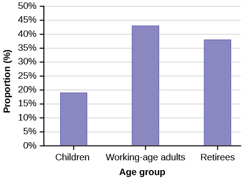
The population in Park City is made up of children, working-age adults, and retirees. [link] shows the three age groups, the number of people in the town from each age group, and the proportion (%) of people in each age group. Construct a bar graph showing the proportions.
| Age groups | Number of people | Proportion of population |
|---|---|---|
| Children | 67,059 | 19% |
| Working-age adults | 152,198 | 43% |
| Retirees | 131,662 | 38% |
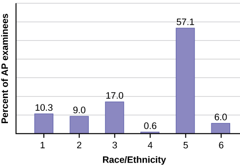
The columns in [link] contain: the race or ethnicity of students in U.S. Public Schools for the class of 2011, percentages for the Advanced Placement examine population for that class, and percentages for the overall student population. Create a bar graph with the student race or ethnicity (qualitative data) on the x -axis, and the Advanced Placement examinee population percentages on the y -axis.
| Race/Ethnicity | AP Examinee Population | Overall Student Population |
|---|---|---|
| 1 = Asian, Asian American or Pacific Islander | 10.3% | 5.7% |
| 2 = Black or African American | 9.0% | 14.7% |
| 3 = Hispanic or Latino | 17.0% | 17.6% |
| 4 = American Indian or Alaska Native | 0.6% | 1.1% |
| 5 = White | 57.1% | 59.2% |
| 6 = Not reported/other | 6.0% | 1.7% |
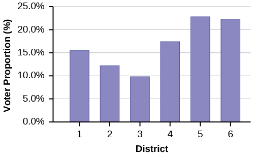
Park city is broken down into six voting districts. The table shows the percent of the total registered voter population that lives in each district as well as the percent total of the entire population that lives in each district. Construct a bar graph that shows the registered voter population by district.
| District | Registered voter population | Overall city population |
|---|---|---|
| 1 | 15.5% | 19.4% |
| 2 | 12.2% | 15.6% |
| 3 | 9.8% | 9.0% |
| 4 | 17.4% | 18.5% |
| 5 | 22.8% | 20.7% |
| 6 | 22.3% | 16.8% |
Burbary, Ken. Facebook Demographics Revisited – 2001 Statistics, 2011. Available online at http://www.kenburbary.com/2011/03/facebook-demographics-revisited-2011-statistics-2/ (accessed August 21, 2013).
“9th Annual AP Report to the Nation.” CollegeBoard, 2013. Available online at http://apreport.collegeboard.org/goals-and-findings/promoting-equity (accessed September 13, 2013).
“Overweight and Obesity: Adult Obesity Facts.” Centers for Disease Control and Prevention. Available online at http://www.cdc.gov/obesity/data/adult.html (accessed September 13, 2013).
A stem-and-leaf plot is a way to plot data and look at the distribution. In a stem-and-leaf plot, all data values within a class are visible. The advantage in a stem-and-leaf plot is that all values are listed, unlike a histogram, which gives classes of data values. A line graph is often used to represent a set of data values in which a quantity varies with time. These graphs are useful for finding trends. That is, finding a general pattern in data sets including temperature, sales, employment, company profit or cost over a period of time. A bar graph is a chart that uses either horizontal or vertical bars to show comparisons among categories. One axis of the chart shows the specific categories being compared, and the other axis represents a discrete value. Some bar graphs present bars clustered in groups of more than one (grouped bar graphs), and others show the bars divided into subparts to show cumulative effect (stacked bar graphs). Bar graphs are especially useful when categorical data is being used.
For each of the following data sets, create a stem plot and identify any outliers.
The miles per gallon rating for 30 cars are shown below (lowest to highest).
19, 19, 19, 20, 21, 21, 25, 25, 25, 26, 26, 28, 29, 31, 31, 32, 32, 33, 34, 35, 36, 37, 37, 38, 38, 38, 38, 41, 43, 43
| Stem | Leaf |
|---|---|
| 1 | 9 9 9 |
| 2 | 0 1 1 5 5 5 6 6 8 9 |
| 3 | 1 1 2 2 3 4 5 6 7 7 8 8 8 8 |
| 4 | 1 3 3 |
The height in feet of 25 trees is shown below (lowest to highest).
25, 27, 33, 34, 34, 34, 35, 37, 37, 38, 39, 39, 39, 40, 41, 45, 46, 47, 49, 50, 50, 53, 53, 54, 54
The data are the prices of different laptops at an electronics store. Round each value to the nearest ten.
249, 249, 260, 265, 265, 280, 299, 299, 309, 319, 325, 326, 350, 350, 350, 365, 369, 389, 409, 459, 489, 559, 569, 570, 610
| Stem | Leaf |
|---|---|
| 2 | 5 5 6 7 7 8 |
| 3 | 0 0 1 2 3 3 5 5 5 7 7 9 |
| 4 | 1 6 9 |
| 5 | 6 7 7 |
| 6 | 1 |
The data are daily high temperatures in a town for one month.
61, 61, 62, 64, 66, 67, 67, 67, 68, 69, 70, 70, 70, 71, 71, 72, 74, 74, 74, 75, 75, 75, 76, 76, 77, 78, 78, 79, 79, 95
For the next three exercises, use the data to construct a line graph.
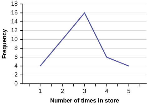
In a survey, 40 people were asked how many times they visited a store before making a major purchase. The results are shown in [link] .
| Number of times in store | Frequency |
|---|---|
| 1 | 4 |
| 2 | 10 |
| 3 | 16 |
| 4 | 6 |
| 5 | 4 |
In a survey, several people were asked how many years it has been since they purchased a mattress. The results are shown in [link] .
| Years since last purchase | Frequency |
|---|---|
| 0 | 2 |
| 1 | 8 |
| 2 | 13 |
| 3 | 22 |
| 4 | 16 |
| 5 | 9 |
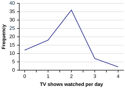
Several children were asked how many TV shows they watch each day. The results of the survey are shown in [link] .
| Number of TV Shows | Frequency |
|---|---|
| 0 | 12 |
| 1 | 18 |
| 2 | 36 |
| 3 | 7 |
| 4 | 2 |
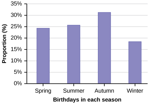
The students in Ms. Ramirez’s math class have birthdays in each of the four seasons. [link] shows the four seasons, the number of students who have birthdays in each season, and the percentage (%) of students in each group. Construct a bar graph showing the number of students.
| Seasons | Number of students | Proportion of population |
|---|---|---|
| Spring | 8 | 24% |
| Summer | 9 | 26% |
| Autumn | 11 | 32% |
| Winter | 6 | 18% |
Using the data from Mrs. Ramirez’s math class supplied in [link] , construct a bar graph showing the percentages.
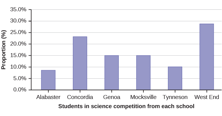
David County has six high schools. Each school sent students to participate in a county-wide science competition. [link] shows the percentage breakdown of competitors from each school, and the percentage of the entire student population of the county that goes to each school. Construct a bar graph that shows the population percentage of competitors from each school.
| High School | Science competition population | Overall student population |
|---|---|---|
| Alabaster | 28.9% | 8.6% |
| Concordia | 7.6% | 23.2% |
| Genoa | 12.1% | 15.0% |
| Mocksville | 18.5% | 14.3% |
| Tynneson | 24.2% | 10.1% |
| West End | 8.7% | 28.8% |
Use the data from the David County science competition supplied in [link] . Construct a bar graph that shows the county-wide population percentage of students at each school.
Notification Switch
Would you like to follow the 'Introductory statistics' conversation and receive update notifications?

|
|

|
|

|
|

|
|

|
|

|
|

|
|
|
|
|

|
|

|
|

|