

| << Chapter < Page | Chapter >> Page > |
A line graph is often the most effective format for illustrating a relationship between two variables that are both changing. For example, time series graphs can show patterns as time changes, like the unemployment rate over time. Line graphs are widely used in economics to present continuous data about prices, wages, quantities bought and sold, the size of the economy.
How Graphs Can Be Misleading
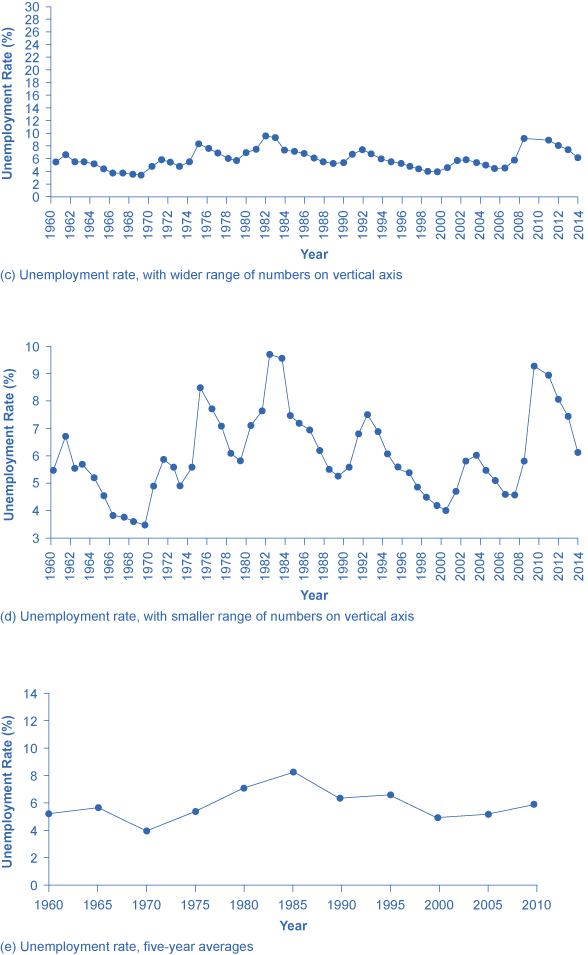
Graphs not only reveal patterns; they can also alter how patterns are perceived. To see some of the ways this can be done, consider the line graphs of [link] , [link] , and [link] . These graphs all illustrate the unemployment rate—but from different perspectives.
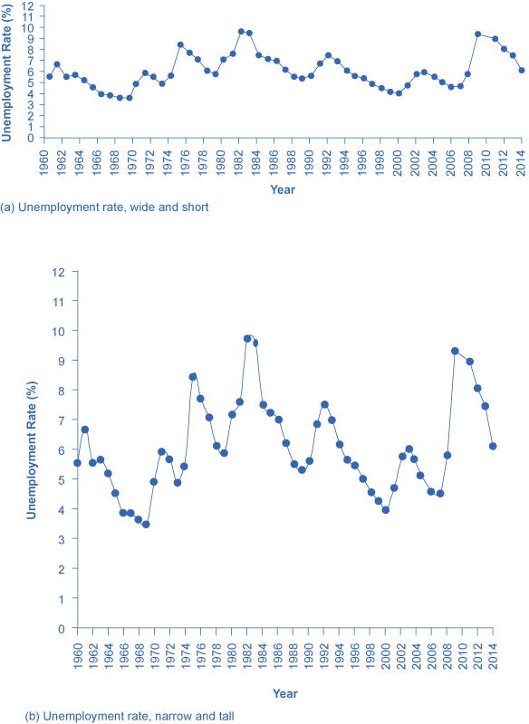
Suppose you wanted a graph which gives the impression that the rise in unemployment in 2009 was not all that large, or all that extraordinary by historical standards. You might choose to present your data as in [link] (a). [link] (a) includes much of the same data presented earlier in [link] , but stretches the horizontal axis out longer relative to the vertical axis. By spreading the graph wide and flat, the visual appearance is that the rise in unemployment is not so large, and is similar to some past rises in unemployment. Now imagine you wanted to emphasize how unemployment spiked substantially higher in 2009. In this case, using the same data, you can stretch the vertical axis out relative to the horizontal axis, as in [link] (b), which makes all rises and falls in unemployment appear larger.
A similar effect can be accomplished without changing the length of the axes, but by changing the scale on the vertical axis. In [link] (c), the scale on the vertical axis runs from 0% to 30%, while in [link] (d), the vertical axis runs from 3% to 10%. Compared to [link] , where the vertical scale runs from 0% to 12%, [link] (c) makes the fluctuation in unemployment look smaller, while [link] (d) makes it look larger.
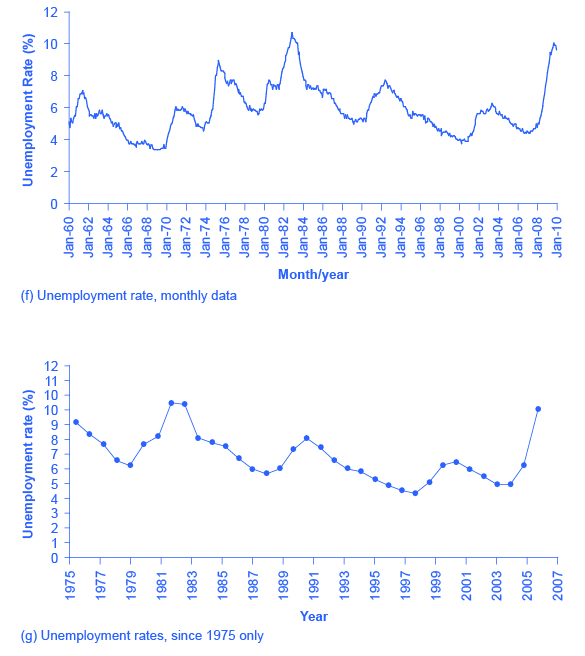
Another way to alter the perception of the graph is to reduce the amount of variation by changing the number of points plotted on the graph. [link] (e) shows the unemployment rate according to five-year averages. By averaging out some of the year- to-year changes, the line appears smoother and with fewer highs and lows. In reality, the unemployment rate is reported monthly, and [link] (f) shows the monthly figures since 1960, which fluctuate more than the five-year average. [link] (f) is also a vivid illustration of how graphs can compress lots of data. The graph includes monthly data since 1960, which over almost 50 years, works out to nearly 600 data points. Reading that list of 600 data points in numerical form would be hypnotic. You can, however, get a good intuitive sense of these 600 data points very quickly from the graph.
A final trick in manipulating the perception of graphical information is that, by choosing the starting and ending points carefully, you can influence the perception of whether the variable is rising or falling. The original data show a general pattern with unemployment low in the 1960s, but spiking up in the mid-1970s, early 1980s, early 1990s, early 2000s, and late 2000s. [link] (g), however, shows a graph that goes back only to 1975, which gives an impression that unemployment was more-or-less gradually falling over time until the 2009 recession pushed it back up to its “original” level—which is a plausible interpretation if one starts at the high point around 1975.
These kinds of tricks—or shall we just call them “presentation choices”— are not limited to line graphs. In a pie chart with many small slices and one large slice, someone must decided what categories should be used to produce these slices in the first place, thus making some slices appear bigger than others. If you are making a bar graph, you can make the vertical axis either taller or shorter, which will tend to make variations in the height of the bars appear more or less.
Being able to read graphs is an essential skill, both in economics and in life. A graph is just one perspective or point of view, shaped by choices such as those discussed in this section. Do not always believe the first quick impression from a graph. View with caution.
Math is a tool for understanding economics and economic relationships can be expressed mathematically using algebra or graphs. The algebraic equation for a line is y = b + mx, where x is the variable on the horizontal axis and y is the variable on the vertical axis, the b term is the y-intercept and the m term is the slope. The slope of a line is the same at any point on the line and it indicates the relationship (positive, negative, or zero) between two economic variables.
Economic models can be solved algebraically or graphically. Graphs allow you to illustrate data visually. They can illustrate patterns, comparisons, trends, and apportionment by condensing the numerical data and providing an intuitive sense of relationships in the data. A line graph shows the relationship between two variables: one is shown on the horizontal axis and one on the vertical axis. A pie graph shows how something is allotted, such as a sum of money or a group of people. The size of each slice of the pie is drawn to represent the corresponding percentage of the whole. A bar graph uses the height of bars to show a relationship, where each bar represents a certain entity, like a country or a group of people. The bars on a bar graph can also be divided into segments to show subgroups.
Any graph is a single visual perspective on a subject. The impression it leaves will be based on many choices, such as what data or time frame is included, how data or groups are divided up, the relative size of vertical and horizontal axes, whether the scale used on a vertical starts at zero. Thus, any graph should be regarded somewhat skeptically, remembering that the underlying relationship can be open to different interpretations.
Name three kinds of graphs and briefly state when is most appropriate to use each type of graph.
What is slope on a line graph?
What do the slices of a pie chart represent?
Why is a bar chart the best way to illustrate comparisons?
How does the appearance of positive slope differ from negative slope and from zero slope?
Notification Switch
Would you like to follow the 'Principles of economics' conversation and receive update notifications?

|
|

|
|

|
|

|
|

|
|

|
|

|
|

|
|

|
|

|
|

|