<< Chapter < Page Chapter >> Page >

Bar Graphs

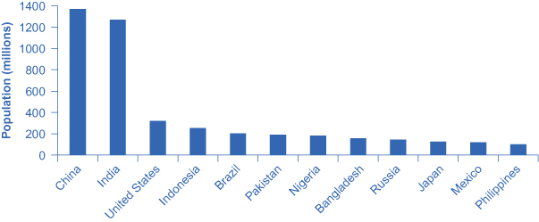
A bar graph uses the height of different bars to compare quantities. [link] lists the 12 most populous countries in the world. [link] provides this same data in a bar graph. The height of the bars corresponds to the population of each country. Although you may know that China and India are the most populous countries in the world, seeing how the bars on the graph tower over the other countries helps illustrate the magnitude of the difference between the sizes of national populations.

Leading countries of the world by population, 2015 (in millions)

The bar graph shows population (millions) on the y-axis and lists various countries along the x-axis. The approximate population in 2015 for each of these countries is as follows: China = 1,369; India = 1,270; Unite States = 321, Indonesia = 255; Brazil = 204; Pakistan = 190; Bangladesh = 158; Russia = 146; Japan = 127; Mexico = 121; Philippines = 101.
The graph shows the 12 countries of the world with the largest populations. The height of the bars in the bar graph shows the size of the population for each country.
Leading 12 countries of the world by population
Country Population
China 1,369
India 1,270
United States 321
Indonesia 255
Brazil 204
Pakistan 190
Nigeria 184
Bangladesh 158
Russia 146
Japan 127
Mexico 121
Philippines 101

Bar graphs can be subdivided in a way that reveals information similar to that we can get from pie charts. [link] offers three bar graphs based on the information from [link] about the U.S. age distribution in 1970, 2000, and 2030. [link] (a) shows three bars for each year, representing the total number of persons in each age bracket for each year. [link] (b) shows just one bar for each year, but the different age groups are now shaded inside the bar. In [link] (c), still based on the same data, the vertical axis measures percentages rather than the number of persons. In this case, all three bar graphs are the same height, representing 100% of the population, with each bar divided according to the percentage of population in each age group. It is sometimes easier for a reader to run his or her eyes across several bar graphs, comparing the shaded areas, rather than trying to compare several pie graphs.

U.s. population with bar graphs

The image shows three bar graphs that represent the U.S. population. All three images reveal the same information presented in different ways. In 1970, people 19 and under made up 77.2 million or 37.6% of the population; people between ages 20 and 64 made up 107.7 million or 52.5% of the population; and people 65 or older made up 20.1 million or 9.8% of the population. In 2000, people 19 and under made up 78.4 million or 28.5% of the population; people between ages 20 and 64 made up 162.2 million or 58.9% of the population; and people 65 or older made up 34.8 million or 12.6% of the population. In 2030, the projection is that people 19 and under will make up 92.6 million or 26.4% of the population; people between ages 20 and 64 made up 188.2 million or 53.6% of the population; and people 65 or older made up 70.3 million or 20% of the population. Image (a) shows separate bar graphs for each age group in each time period (so 9 bars total). Image (b) shows the total population divided into age groups (so 3 bars total, with different color coding to identify the portions pertaining to different ages). Image (c) shows the total population divided into percentages to reveal the prediction that in 2030 (so 3 bars total, with different color coding to identify the portions pertaining to different ages).
Population data can be represented in different ways. (a) Shows three bars for each year, representing the total number of persons in each age bracket for each year. (b) Shows just one bar for each year, but the different age groups are now shaded inside the bar. (c) Sets the vertical axis as a measure of percentages rather than the number of persons. All three bar graphs are the same height and each bar is divided according to the percentage of population in each age group.

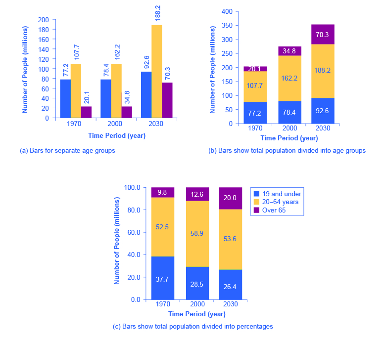
[link] and [link] show how the bars can represent countries or years, and how the vertical axis can represent a numerical or a percentage value. Bar graphs can also compare size, quantity, rates, distances, and other quantitative categories.

Comparing Line Graphs with Pie Charts and Bar Graphs

Now that you are familiar with pie graphs, bar graphs, and line graphs, how do you know which graph to use for your data? Pie graphs are often better than line graphs at showing how an overall group is divided. However, if a pie graph has too many slices, it can become difficult to interpret.

Bar graphs are especially useful when comparing quantities. For example, if you are studying the populations of different countries, as in [link] , bar graphs can show the relationships between the population sizes of multiple countries. Not only can it show these relationships, but it can also show breakdowns of different groups within the population.

Questions & Answers

Discuss the differences between taste and flavor, including how other sensory inputs contribute to our  perception of flavor.
John Reply
taste refers to your understanding of the flavor . while flavor one The other hand is refers to sort of just a blend things.
Faith
While taste primarily relies on our taste buds, flavor involves a complex interplay between taste and aroma
Kamara
which drugs can we use for ulcers
Ummi Reply
omeprazole
Kamara
what
Renee
what is this
Renee
is a drug
Kamara
of anti-ulcer
Kamara
Omeprazole Cimetidine / Tagament For the complicated once ulcer - kit
Patrick
what is the function of lymphatic system
Nency Reply
Not really sure
Eli
to drain extracellular fluid all over the body.
asegid
The lymphatic system plays several crucial roles in the human body, functioning as a key component of the immune system and contributing to the maintenance of fluid balance. Its main functions include: 1. Immune Response: The lymphatic system produces and transports lymphocytes, which are a type of
asegid
to transport fluids fats proteins and lymphocytes to the blood stream as lymph
Adama
what is anatomy
Oyindarmola Reply
Anatomy is the identification and description of the structures of living things
Kamara
what's the difference between anatomy and physiology
Oyerinde Reply
Anatomy is the study of the structure of the body, while physiology is the study of the function of the body. Anatomy looks at the body's organs and systems, while physiology looks at how those organs and systems work together to keep the body functioning.
AI-Robot
what is enzymes all about?
Mohammed Reply
Enzymes are proteins that help speed up chemical reactions in our bodies. Enzymes are essential for digestion, liver function and much more. Too much or too little of a certain enzyme can cause health problems
Kamara
yes
Prince
how does the stomach protect itself from the damaging effects of HCl
Wulku Reply
little girl okay how does the stomach protect itself from the damaging effect of HCL
Wulku
it is because of the enzyme that the stomach produce that help the stomach from the damaging effect of HCL
Kamara
function of digestive system
Ali Reply
function of digestive
Ali
the diagram of the lungs
Adaeze Reply
what is the normal body temperature
Diya Reply
37 degrees selcius
Xolo
37°c
Stephanie
please why 37 degree selcius normal temperature
Mark
36.5
Simon
37°c
Iyogho
the normal temperature is 37°c or 98.6 °Fahrenheit is important for maintaining the homeostasis in the body the body regular this temperature through the process called thermoregulation which involves brain skin muscle and other organ working together to maintain stable internal temperature
Stephanie
37A c
Wulku
what is anaemia
Diya Reply
anaemia is the decrease in RBC count hemoglobin count and PVC count
Eniola
what is the pH of the vagina
Diya Reply
how does Lysin attack pathogens
Diya
acid
Mary
I information on anatomy position and digestive system and there enzyme
Elisha Reply
anatomy of the female external genitalia
Muhammad Reply
Organ Systems Of The Human Body (Continued) Organ Systems Of The Human Body (Continued)
Theophilus Reply
what's lochia albra
Kizito
Got questions? Join the online conversation and get instant answers!
Jobilize.com Reply

Get Jobilize Job Search Mobile App in your pocket Now!

Get it on Google Play Download on the App Store Now


Source:  OpenStax, Principles of economics. OpenStax CNX. Sep 19, 2014 Download for free at http://legacy.cnx.org/content/col11613/1.11
Google Play and the Google Play logo are trademarks of Google Inc.

Notification Switch

Would you like to follow the 'Principles of economics' conversation and receive update notifications?

Ask