

| << Chapter < Page | Chapter >> Page > |
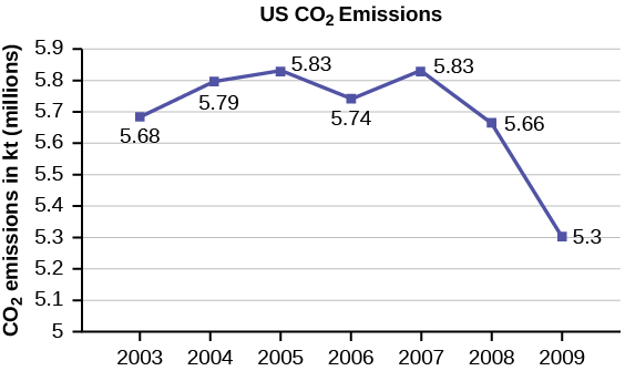
The following table is a portion of a data set from www.worldbank.org. Use the table to construct a time series graph for CO 2 emissions for the United States.
| CO2 Emissions | |||
|---|---|---|---|
| Ukraine | United Kingdom | United States | |
| 2003 | 352,259 | 540,640 | 5,681,664 |
| 2004 | 343,121 | 540,409 | 5,790,761 |
| 2005 | 339,029 | 541,990 | 5,826,394 |
| 2006 | 327,797 | 542,045 | 5,737,615 |
| 2007 | 328,357 | 528,631 | 5,828,697 |
| 2008 | 323,657 | 522,247 | 5,656,839 |
| 2009 | 272,176 | 474,579 | 5,299,563 |
Time series graphs are important tools in various applications of statistics. When recording values of the same variable over an extended period of time, sometimes it is difficult to discern any trend or pattern. However, once the same data points are displayed graphically, some features jump out. Time series graphs make trends easy to spot.
Data on annual homicides in Detroit, 1961–73, from Gunst&Mason’s book ‘Regression Analysis and its Application’, Marcel Dekker
“Timeline: Guide to the U.S. Presidents: Information on every president’s birthplace, political party, term of office, and more.” Scholastic, 2013. Available online at http://www.scholastic.com/teachers/article/timeline-guide-us-presidents (accessed April 3, 2013).
“Presidents.” Fact Monster. Pearson Education, 2007. Available online at http://www.factmonster.com/ipka/A0194030.html (accessed April 3, 2013).
“Food Security Statistics.” Food and Agriculture Organization of the United Nations. Available online at http://www.fao.org/economic/ess/ess-fs/en/ (accessed April 3, 2013).
“Consumer Price Index.” United States Department of Labor: Bureau of Labor Statistics. Available online at http://data.bls.gov/pdq/SurveyOutputServlet (accessed April 3, 2013).
“CO2 emissions (kt).” The World Bank, 2013. Available online at http://databank.worldbank.org/data/home.aspx (accessed April 3, 2013).
“Births Time Series Data.” General Register Office For Scotland, 2013. Available online at http://www.gro-scotland.gov.uk/statistics/theme/vital-events/births/time-series.html (accessed April 3, 2013).
“Demographics: Children under the age of 5 years underweight.” Indexmundi. Available online at http://www.indexmundi.com/g/r.aspx?t=50&v=2224&aml=en (accessed April 3, 2013).
Gunst, Richard, Robert Mason. Regression Analysis and Its Application: A Data-Oriented Approach . CRC Press: 1980.
“Overweight and Obesity: Adult Obesity Facts.” Centers for Disease Control and Prevention. Available online at http://www.cdc.gov/obesity/data/adult.html (accessed September 13, 2013).
A histogram is a graphic version of a frequency distribution. The graph consists of bars of equal width drawn adjacent to each other. The horizontal scale represents classes of quantitative data values and the vertical scale represents frequencies. The heights of the bars correspond to frequency values. Histograms are typically used for large, continuous, quantitative data sets. A frequency polygon can also be used when graphing large data sets with data points that repeat. The data usually goes on y -axis with the frequency being graphed on the x -axis. Time series graphs can be helpful when looking at large amounts of data for one variable over a period of time.
Notification Switch
Would you like to follow the 'Introductory statistics' conversation and receive update notifications?

|
|

|
|

|
|

|
|

|
|

|
|

|
|

|
|

|
|

|
|

|