<< Chapter < Page Chapter >> Page >

Learning objectives

By the end of this section, you will be able to:

  • Determine the age of a protostar using an H–R diagram    and the protostar’s luminosity and temperature
  • Explain the interplay between gravity and pressure, and how the contracting protostar changes its position in the H–R diagram as a result

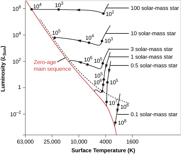
One of the best ways to summarize all of these details about how a star or protostar changes with time is to use a Hertzsprung-Russell (H–R) diagram. Recall from The Stars: A Celestial Census that, when looking at an H–R diagram, the temperature (the horizontal axis) is plotted increasing toward the left. As a star goes through the stages of its life, its luminosity and temperature change. Thus, its position on the H–R diagram, in which luminosity is plotted against temperature, also changes. As a star ages, we must replot it in different places on the diagram. Therefore, astronomers often speak of a star moving on the H–R diagram, or of its evolution tracing out a path on the diagram. In this context, “tracing out a path” has nothing to do with the star’s motion through space; this is just a shorthand way of saying that its temperature and luminosity change as it evolves.

To estimate just how much the luminosity and temperature of a star change as it ages, we must resort to calculations. Theorists compute a series of models for a star, with each successive model representing a later point in time. Stars may change for a variety of reasons. Protostars, for example, change in size because they are contracting, and their temperature and luminosity change as they do so. After nuclear fusion begins in the star’s core (see Stars from Adolescence to Old Age ), main-sequence stars change because they are using up their nuclear fuel.

Given a model that represents a star at one stage of its evolution, we can calculate what it will be like at a slightly later time. At each step, the model predicts the luminosity and size of the star, and from these values, we can figure out its surface temperature. A series of points on an H–R diagram, calculated in this way, allows us to follow the life changes of a star and hence is called its evolutionary track .

Evolutionary tracks

Let’s now use these ideas to follow the evolution of protostars that are on their way to becoming main-sequence stars. The evolutionary tracks of newly forming stars with a range of stellar masses are shown in [link] . These young stellar objects are not yet producing energy by nuclear reactions, but they derive energy from gravitational contraction—through the sort of process proposed for the Sun by Helmhotz and Kelvin in this last century (see the chapter on The Sun: A Nuclear Powerhouse ).

Evolutionary tracks for contracting protostars.

An H-R Diagram of the Evolutionary Tracks for Contracting Protostars. The vertical scale is labeled “Luminosity”, in units of the luminosity of the Sun. The scale starts at 10-4 at the bottom and goes to 106 at the top. The horizontal scale is labeled “Surface Temperature (K)”, in degrees Kelvin. The scale begins at 63,000 on the left down to 1,600 on the far right. A red line running diagonally across the diagram from upper left to lower right marks the zero-age main sequence. A black dashed line is drawn slightly above the red line, above which stars may still be surrounded by infalling material. Six curves are shown to illustrate how stars of different masses change as they evolve toward the zero-age main sequence. On each curve are dots indicating the amount of time since the initial collapse that it takes for the star to reach that position on the H-R diagram. For example, after 100 years a 100 Solar mass star will have collapsed to the point that its temperature is about 4000 K, and its luminosity is nearly 106 that of the Sun. At 1000 years the temperature is now about 20,000 K and nearly the same luminosity. At 10,000 years the star has reached the zero-age main sequence with a surface temperature of nearly 50,000 K and luminosity 106 times Solar. As a further example, a star of one Solar mass takes longer to collapse. At 100,000 years its temperature is just above 4000 K and its luminosity as about 3 times Solar. At one million years the temperature has increased slightly, but the luminosity as dropped to about 1.5. When it finally settles on the zero-age main sequence, the temperature has risen to over 5000 K, and its luminosity has dropped to one.
Tracks are plotted on the H–R diagram to show how stars of different masses change during the early parts of their lives. The number next to each dark point on a track is the rough number of years it takes an embryo star to reach that stage (the numbers are the result of computer models and are therefore not well known). Note that the surface temperature (K) on the horizontal axis increases toward the left. You can see that the more mass a star has, the shorter time it takes to go through each stage. Stars above the dashed line are typically still surrounded by infalling material and are hidden by it.

Questions & Answers

What is inflation
Bright Reply
a general and ongoing rise in the level of prices in an economy
AI-Robot
What are the factors that affect demand for a commodity
Florence Reply
differentiate between demand and supply giving examples
Lambiv Reply
differentiated between demand and supply using examples
Lambiv
what is labour ?
Lambiv
how will I do?
Venny Reply
how is the graph works?I don't fully understand
Rezat Reply
information
Eliyee
devaluation
Eliyee
t
WARKISA
hi guys good evening to all
Lambiv
multiple choice question
Aster Reply
appreciation
Eliyee
explain perfect market
Lindiwe Reply
In economics, a perfect market refers to a theoretical construct where all participants have perfect information, goods are homogenous, there are no barriers to entry or exit, and prices are determined solely by supply and demand. It's an idealized model used for analysis,
Ezea
What is ceteris paribus?
Shukri Reply
other things being equal
AI-Robot
When MP₁ becomes negative, TP start to decline. Extuples Suppose that the short-run production function of certain cut-flower firm is given by: Q=4KL-0.6K2 - 0.112 • Where is quantity of cut flower produced, I is labour input and K is fixed capital input (K-5). Determine the average product of lab
Kelo
Extuples Suppose that the short-run production function of certain cut-flower firm is given by: Q=4KL-0.6K2 - 0.112 • Where is quantity of cut flower produced, I is labour input and K is fixed capital input (K-5). Determine the average product of labour (APL) and marginal product of labour (MPL)
Kelo
yes,thank you
Shukri
Can I ask you other question?
Shukri
what is monopoly mean?
Habtamu Reply
What is different between quantity demand and demand?
Shukri Reply
Quantity demanded refers to the specific amount of a good or service that consumers are willing and able to purchase at a give price and within a specific time period. Demand, on the other hand, is a broader concept that encompasses the entire relationship between price and quantity demanded
Ezea
ok
Shukri
how do you save a country economic situation when it's falling apart
Lilia Reply
what is the difference between economic growth and development
Fiker Reply
Economic growth as an increase in the production and consumption of goods and services within an economy.but Economic development as a broader concept that encompasses not only economic growth but also social & human well being.
Shukri
production function means
Jabir
What do you think is more important to focus on when considering inequality ?
Abdisa Reply
any question about economics?
Awais Reply
sir...I just want to ask one question... Define the term contract curve? if you are free please help me to find this answer 🙏
Asui
it is a curve that we get after connecting the pareto optimal combinations of two consumers after their mutually beneficial trade offs
Awais
thank you so much 👍 sir
Asui
In economics, the contract curve refers to the set of points in an Edgeworth box diagram where both parties involved in a trade cannot be made better off without making one of them worse off. It represents the Pareto efficient allocations of goods between two individuals or entities, where neither p
Cornelius
In economics, the contract curve refers to the set of points in an Edgeworth box diagram where both parties involved in a trade cannot be made better off without making one of them worse off. It represents the Pareto efficient allocations of goods between two individuals or entities,
Cornelius
Suppose a consumer consuming two commodities X and Y has The following utility function u=X0.4 Y0.6. If the price of the X and Y are 2 and 3 respectively and income Constraint is birr 50. A,Calculate quantities of x and y which maximize utility. B,Calculate value of Lagrange multiplier. C,Calculate quantities of X and Y consumed with a given price. D,alculate optimum level of output .
Feyisa Reply
Answer
Feyisa
c
Jabir
Got questions? Join the online conversation and get instant answers!
Jobilize.com Reply

Get Jobilize Job Search Mobile App in your pocket Now!

Get it on Google Play Download on the App Store Now


Source:  OpenStax, Astronomy. OpenStax CNX. Apr 12, 2017 Download for free at http://cnx.org/content/col11992/1.13
Google Play and the Google Play logo are trademarks of Google Inc.

Notification Switch

Would you like to follow the 'Astronomy' conversation and receive update notifications?

Ask