Home
Introductory statistics Introductory statistics
Notes for the ti-83, 83+, 84,
To deselect equations:
Access the list of equations.
Select each equal sign (=).
Continue, until all equations are deselected.
To clear equations:
Access the list of equations.
Use the arrow keys to navigate to the right of each equal sign (=) and clear them.
Repeat until all equations are deleted.
To draw default histogram:
Access the ZOOM menu.
Select
<9:ZoomStat> .
The histogram will show with a window automatically set.
To draw custom histogram:
Access window mode to set the graph parameters.
X
min
=
–2.5
X
max
=
3.5
X
s
c
l
=
1 (width of bars)
Y
min
=
0
Y
max
=
10
Y
s
c
l
=
1 (spacing of tick marks on
y -axis)
X
r
e
s
=
1
Access graphing mode to see the histogram.
To draw box plots:
Access graphing mode.
,
[STAT PLOT]
Select
<1:Plot 1> to access the first graph.
Use the arrows to select
<ON> and turn on Plot 1.
Use the arrows to select the box plot picture and enable it.
Use the arrows to navigate to
<Xlist> .
If "L1" is not selected, select it.
,
[L1] ,
Use the arrows to navigate to
<Freq> .
Indicate that the frequencies are in
[L2] .
,
[L2] ,
Go back to access other graphs.
,
[STAT PLOT]
Be sure to deselect or clear all equations before graphing using the method mentioned above.
View the box plot.
,
[STAT PLOT]
Linear regression
Sample data
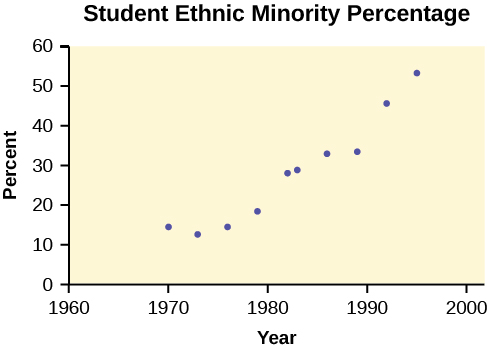
The following data is real. The percent of declared ethnic minority students at De Anza College for selected years from 1970–1995 was:
Year
Student Ethnic Minority Percentage
1970
14.13
1973
12.27
1976
14.08
1979
18.16
1982
27.64
1983
28.72
1986
31.86
1989
33.14
1992
45.37
1995
53.1
The independent variable is "Year," while the independent variable is "Student Ethnic Minority Percent."
Student ethnic minority percentage
By hand, verify the scatterplot above.
Note
The TI-83 has a built-in linear regression feature, which allows the data to be edited.The
x -values will be in
[L1] ; the
y -values in
[L2] .
To enter data and do linear regression:
ON Turns calculator on.
Before accessing this program, be sure to turn off all plots.
Round to three decimal places. To do so:
Access the mode menu.
,
[STAT PLOT]
Navigate to
<Float> and then to the right to
<3> .
All numbers will be rounded to three decimal places until changed.
Enter statistics mode and clear lists
[L1] and
[L2] , as describe previously.
,
Enter editing mode to insert values for
x and
y .
,
Enter each value. Press
to continue.
To display the correlation coefficient:
Access the catalog.
,
[CATALOG]
Arrow down and select
<DiagnosticOn>
... ,
,
r and
r
2 will be displayed during regression calculations.
Access linear regression.
Select the form of
y =
a +
bx .
,
Linreg
y =
a +
bx
a = –3176.909
b = 1.617
r = 2 0.924
r = 0.961
y = –3176.909 + 1.617
x
Percent = –3176.909 + 1.617 (year #) The correlation coefficient
r = 0.961
To see the scatter plot:
Access graphing mode.
,
[STAT PLOT]
Select
<1:plot 1> To access plotting - first graph.
Navigate and select
<ON> to turn on Plot 1.
<ON>
Navigate to the first picture.
Select the scatter plot.
Navigate to
<Xlist> .
If
[L1] is not selected, press
,
[L1] to select it.
Confirm that the data values are in
[L1] .
<ON>
Navigate to
<Ylist> .
Select that the frequencies are in
[L2] .
,
[L2] ,
Go back to access other graphs.
,
[STAT PLOT]
Use the arrows to turn off the remaining plots.
Access window mode to set the graph parameters.
X
min
=
1970
X
max
=
2000
X
s
c
l
=
10 (spacing of tick marks on
x -axis)
Y
min
=
−
0.05
Y
max
=
60
Y
s
c
l
=
10 (spacing of tick marks on
y -axis)
X
r
e
s
=
1
Be sure to deselect or clear all equations before graphing, using the instructions above.
Press the graph button to see the scatter plot.
Questions & Answers
Ayele, K., 2003. Introductory Economics, 3rd ed., Addis Ababa.
can you send the book attached ?
Ariel
the study of how humans make choices under conditions of scarcity
AI-Robot
U(x,y) = (x×y)1/2
find mu of x for y
U(x,y) = (xÃy)1/2
find mu of x for y
Desalegn
this is the study of how the society manages it's scarce resources
Belonwu
macroeconomic is the branch of economics which studies actions, scale, activities and behaviour of the aggregate economy as a whole.
husaini
difference between firm and industry
what's the difference between a firm and an industry
Abdul
firm is the unit which transform inputs to output where as industry contain combination of firms with similar production 😅😅
Abdulraufu
Suppose the demand function that a firm faces shifted from
Qd 120 3P
to
Qd 90 3P
and the supply function has shifted from
QS
20 2P
to
QS
10 2P .
a) Find the effect of this change on price and quantity.
b) Which of the changes in demand and supply is higher?
explain standard reason why economic is a science
factors influencing supply
scares
means__________________ends
resources. unlimited
Jan
economics is a science that studies human behaviour as a relationship b/w ends and scares means which have alternative uses
Jan
calculate the profit maximizing for demand and supply
Why qualify 28 supplies
Milan
out-of-pocket costs for a firm, for example, payments for wages and salaries, rent, or materials
AI-Robot
concepts of supply in microeconomics
identify a demand and a supply curve
there's a difference
Aryan
Demand curve shows that how supply and others conditions affect on demand of a particular thing and what percent demand increase whith increase of supply of goods
Israr
Hi Sir please how do u calculate Cross elastic demand and income elastic demand?
Abari
Got questions? Join the online conversation and get instant answers!
Source:
OpenStax, Introductory statistics. OpenStax CNX. May 06, 2016 Download for free at http://legacy.cnx.org/content/col11562/1.18
Google Play and the Google Play logo are trademarks of Google Inc.