<< Chapter < Page Chapter >> Page >

Graphical representation of data

Once the data has been collected, it must be organised in a manner that allows for the information to be extracted most efficiently. One method of organisation is to display the data in the form of graphs. Functions and graphs have been studied in  Functions and Graphs , and similar techniques will be used here. However, instead of drawing graphs from equations as was done in Functions and graphs , bar graphs, histograms and pie charts will be drawn directly from the data.

Bar and compound bar graphs

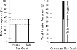
A bar chart is used to present data where each observation falls into a specific category and where the categories, this is often for qualitative data. The frequencies (or percentages) are listed along the y -axis and the categories are listed along the x -axis. The heights of the bars correspond to the frequencies. The bars are of equal width and should not touch neighbouring bars.

A compound bar chart (also called component bar chart) is a variant: here the bars are cut into various components depending on what is being shown. If percentages are used for various components of a compound bar, then the total bar height must be 100%. The compound bar chart is a little more complex but if this method is used sensibly, a lot of information can be quickly shown in an attractive fashion.

Examples of a bar and a compound bar graph, for Data Set 1 , are shown in [link] . According to the frequency table for Data Set 1, the coin landed heads-up 44 times and tails-up 56 times.

Examples of a bar graph (left) and compound bar graph (right) for Data Set 1. The compound bar graph extends from 0% to 100%.

Histograms and frequency polygons

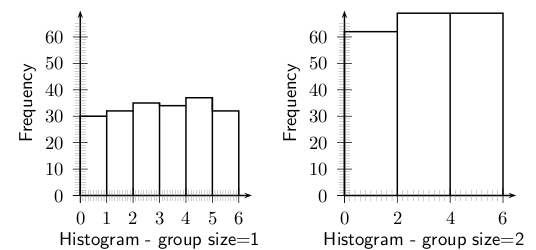
It is often useful to look at the frequency with which certain values fall in pre-set groups or classes of specified sizes. The choice of the groups should be such that they help highlight features in the data. If these grouped values are plotted in a manner similar to a bar graph, then the resulting graph is known as a histogram. Examples of histograms are shown in [link] for Data Set 2, with group sizes of 1 and 2.

Frequency table for Data Set 2, with a group size of 1.
Groups 0 < n 1 1 < n 2 2 < n 3 3 < n 4 4 < n 5 5 < n 6
Frequency 30 32 35 34 37 32
Frequency table for Data Set 2, with a group size of 2.
Groups 0 < n 2 2 < n 4 4 < n 6
Frequency 62 69 69
Examples of histograms for Data Set 2, with a group size = 1 (left) and a group size = 2 (right). The scales on the y -axis for each graph are the same, and the values in the graph on the right are higher than the values of the graph on the left.

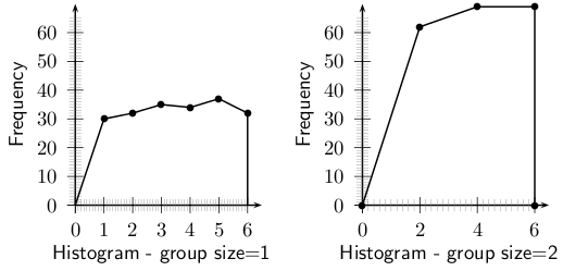
The same data used to plot a histogram are used to plot a frequency polygon, except the pair of data values are plotted as a point and the points are joined with straight lines. The frequency polygons for the histograms in [link] are shown in [link] .

Examples of histograms for Data Set 2, with a group size = 1 (left) and a group size = 2 (right). The scales on the y -axis for each graph are the same, and the values in the graph on the right are higher than the values of the graph on the left.

Questions & Answers

Ayele, K., 2003. Introductory Economics, 3rd ed., Addis Ababa.
Widad Reply
can you send the book attached ?
Ariel
?
Ariel
What is economics
Widad Reply
the study of how humans make choices under conditions of scarcity
AI-Robot
U(x,y) = (x×y)1/2 find mu of x for y
Desalegn Reply
U(x,y) = (x×y)1/2 find mu of x for y
Desalegn
what is ecnomics
Jan Reply
this is the study of how the society manages it's scarce resources
Belonwu
what is macroeconomic
John Reply
macroeconomic is the branch of economics which studies actions, scale, activities and behaviour of the aggregate economy as a whole.
husaini
etc
husaini
difference between firm and industry
husaini Reply
what's the difference between a firm and an industry
Abdul
firm is the unit which transform inputs to output where as industry contain combination of firms with similar production 😅😅
Abdulraufu
Suppose the demand function that a firm faces shifted from Qd  120 3P to Qd  90  3P and the supply function has shifted from QS  20  2P to QS 10  2P . a) Find the effect of this change on price and quantity. b) Which of the changes in demand and supply is higher?
Toofiq Reply
explain standard reason why economic is a science
innocent Reply
factors influencing supply
Petrus Reply
what is economic.
Milan Reply
scares means__________________ends resources. unlimited
Jan
economics is a science that studies human behaviour as a relationship b/w ends and scares means which have alternative uses
Jan
calculate the profit maximizing for demand and supply
Zarshad Reply
Why qualify 28 supplies
Milan
what are explicit costs
Nomsa Reply
out-of-pocket costs for a firm, for example, payments for wages and salaries, rent, or materials
AI-Robot
concepts of supply in microeconomics
David Reply
economic overview notes
Amahle Reply
identify a demand and a supply curve
Salome Reply
i don't know
Parul
there's a difference
Aryan
Demand curve shows that how supply and others conditions affect on demand of a particular thing and what percent demand increase whith increase of supply of goods
Israr
Hi Sir please how do u calculate Cross elastic demand and income elastic demand?
Abari
Got questions? Join the online conversation and get instant answers!
Jobilize.com Reply

Get Jobilize Job Search Mobile App in your pocket Now!

Get it on Google Play Download on the App Store Now


Source:  OpenStax, Siyavula textbooks: grade 10 maths [ncs]. OpenStax CNX. Aug 05, 2011 Download for free at http://cnx.org/content/col11239/1.2
Google Play and the Google Play logo are trademarks of Google Inc.

Notification Switch

Would you like to follow the 'Siyavula textbooks: grade 10 maths [ncs]' conversation and receive update notifications?

Ask