

| << Chapter < Page | Chapter >> Page > |
The shape of a data set is important to know.
This describes how the data is distributed relative to the mean and median.
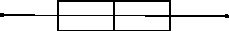
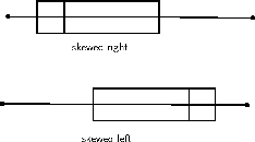
The relationship of the mean, median, and mode to each other can provide some information about the relative shape of the data distribution. If the mean, median, and mode are approximately equal to each other, the distribution can be assumed to be approximately symmetrical. With both the mean and median known, the following can be concluded:
| Set 1 | Set 2 | Set 3 |
| 25 | 32 | 43 |
| 47 | 34 | 47 |
| 15 | 35 | 16 |
| 17 | 32 | 43 |
| 16 | 25 | 38 |
| 26 | 16 | 44 |
| 24 | 38 | 42 |
| 27 | 47 | 50 |
| 22 | 43 | 50 |
| 24 | 29 | 44 |
| 12 | 18 | 43 |
| 31 | 25 | 42 |
A scatter-plot is a graph that shows the relationship between two variables. We say this is bivariate data and we plot the data from two different sets using ordered pairs. For example, we could have mass on the horizontal axis (first variable) and height on the second axis (second variable), or we could have current on the horizontal axis and voltage on the vertical axis.
Ohm's Law is an important relationship in physics. Ohm's law describes the relationship between current and voltage in a conductor, like a piece of wire. When we measure the voltage (dependent variable) that results from a certain current (independent variable) in a wire, we get the data points as shown in [link] .
| Current | Voltage | Current | Voltage |
| 0 | 0,4 | 2,4 | 1,4 |
| 0,2 | 0,3 | 2,6 | 1,6 |
| 0,4 | 0,6 | 2,8 | 1,9 |
| 0,6 | 0,6 | 3 | 1,9 |
| 0,8 | 0,4 | 3,2 | 2 |
| 1 | 1 | 3,4 | 1,9 |
| 1,2 | 0,9 | 3,6 | 2,1 |
| 1,4 | 0,7 | 3,8 | 2,1 |
| 1,6 | 1 | 4 | 2,4 |
| 1,8 | 1,1 | 4,2 | 2,4 |
| 2 | 1,3 | 4,4 | 2,5 |
| 2,2 | 1,1 | 4,6 | 2,5 |
When we plot this data as points, we get the scatter plot shown in [link] .
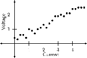
If we are to come up with a function that best describes the data, we would have to say that a straight line best describes this data.
Ohm's Law describes the relationship between current and voltage in a conductor. The gradient of the graph of voltage vs. current is known as the resistance of the conductor.
The function that best describes a set of data can take any form. We will restrict ourselves to the forms already studied, that is, linear, quadratic or exponential. Plot the following sets of data as scatter plots and deduce the type of function that best describes the data. The type of function can either be quadratic or exponential.
| x | y | x | y | x | y | x | y |
| -5 | 9,8 | 0 | 14,2 | -2,5 | 11,9 | 2,5 | 49,3 |
| -4,5 | 4,4 | 0,5 | 22,5 | -2 | 6,9 | 3 | 68,9 |
| -4 | 7,6 | 1 | 21,5 | -1,5 | 8,2 | 3,5 | 88,4 |
| -3,5 | 7,9 | 1,5 | 27,5 | -1 | 7,8 | 4 | 117,2 |
| -3 | 7,5 | 2 | 41,9 | -0,5 | 14,4 | 4,5 | 151,4 |
| x | y | x | y | x | y | x | y |
| -5 | 75 | 0 | 5 | -2,5 | 27,5 | 2,5 | 7,5 |
| -4,5 | 63,5 | 0,5 | 3,5 | -2 | 21 | 3 | 11 |
| -4 | 53 | 1 | 3 | -1,5 | 15,5 | 3,5 | 15,5 |
| -3,5 | 43,5 | 1,5 | 3,5 | -1 | 11 | 4 | 21 |
| -3 | 35 | 2 | 5 | -0,5 | 7,5 | 4,5 | 27,5 |
| Height (cm) | 147 | 150 | 152 | 155 | 157 | 160 | 163 | 165 |
| 168 | 170 | 173 | 175 | 178 | 180 | 183 | ||
| Weight (kg) | 52 | 53 | 54 | 56 | 57 | 59 | 60 | 61 |
| 63 | 64 | 66 | 68 | 70 | 72 | 74 |
A point on a scatter plot which is widely separated from the other points or a result differing greatly from others in the same sample is called an outlier.
The following simulation allows you to plot scatter plots and fit a curve to the plot. Ignore the error bars (blue lines) on the points.
Phet simulation for scatter plots
| Score (percent) | Time spent studying (minutes) |
| 67 | 100 |
| 55 | 85 |
| 70 | 150 |
| 90 | 180 |
| 45 | 70 |
| 75 | 160 |
| 50 | 80 |
| 60 | 90 |
| 84 | 110 |
| 30 | 60 |
| 66 | 96 |
| 96 | 200 |
| Practice time (min) | Ranking |
| 154 | 5 |
| 390 | 1 |
| 130 | 6 |
| 70 | 8 |
| 240 | 3 |
| 280 | 2 |
| 175 | 4 |
| 103 | 7 |
| Number of sweets (per week) | Average sleeping time (per day) |
| 15 | 4 |
| 12 | 4,5 |
| 5 | 8 |
| 3 | 8,5 |
| 18 | 3 |
| 23 | 2 |
| 11 | 5 |
| 4 | 8 |
Notification Switch
Would you like to follow the 'Siyavula textbooks: grade 11 maths' conversation and receive update notifications?

|
|

|
|

|
|

|
|

|
|

|
|

|
|

|
|
|
|

|