<< Chapter < Page Chapter >> Page >

Equilibrium in the aggregate demand/aggregate supply model

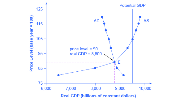
The intersection of the aggregate supply and aggregate demand curves shows the equilibrium level of real GDP and the equilibrium price level in the economy. At a relatively low price level for output, firms have little incentive to produce, although consumers would be willing to purchase a high quantity. As the price level for outputs rises, aggregate supply rises and aggregate demand falls until the equilibrium point is reached.

[link] combines the AS curve from [link] and the AD curve from [link] and places them both on a single diagram. In this example, the equilibrium point occurs at point E, at a price level of 90 and an output level of 8,800.

Aggregate supply and aggregate demand

The graph shows a downward sloping aggregate demand curve that intersects with an upward sloping aggregate supply curve at the point (8,800, 90).
The equilibrium, where aggregate supply (AS) equals aggregate demand (AD), occurs at a price level of 90 and an output level of 8,800.

Confusion sometimes arises between the aggregate supply and aggregate demand model and the microeconomic analysis of demand and supply in particular markets for goods, services, labor, and capital. Read the following Clear It Up feature to gain an understanding of whether AS and AD are macro or micro.

Are as and ad macro or micro?

These aggregate supply and aggregate demand model and the microeconomic analysis of demand and supply in particular markets for goods, services, labor, and capital have a superficial resemblance, but they also have many underlying differences.

For example, the vertical and horizontal axes have distinctly different meanings in macroeconomic and microeconomic diagrams. The vertical axis of a microeconomic demand and supply diagram expresses a price (or wage or rate of return) for an individual good or service. This price is implicitly relative: it is intended to be compared with the prices of other products (for example, the price of pizza relative to the price of fried chicken). In contrast, the vertical axis of an aggregate supply and aggregate demand diagram expresses the level of a price index like the Consumer Price Index or the GDP deflator—combining a wide array of prices from across the economy. The price level is absolute: it is not intended to be compared to any other prices since it is essentially the average price of all products in an economy. The horizontal axis of a microeconomic supply and demand curve measures the quantity of a particular good or service. In contrast, the horizontal axis of the aggregate demand and aggregate supply diagram measures GDP, which is the sum of all the final goods and services produced in the economy, not the quantity in a specific market.

In addition, the economic reasons for the shapes of the curves in the macroeconomic model are different from the reasons behind the shapes of the curves in microeconomic models. Demand curves for individual goods or services slope down primarily because of the existence of substitute goods, not the wealth effects, interest rate, and foreign price effects associated with aggregate demand curves. The slopes of individual supply and demand curves can have a variety of different slopes, depending on the extent to which quantity demanded and quantity supplied react to price in that specific market, but the slopes of the AS and AD curves are much the same in every diagram (although as we shall see in later chapters, short-run and long-run perspectives will emphasize different parts of the AS curve).

In short, just because the AD/AS diagram has two lines that cross, do not assume that it is the same as every other diagram where two lines cross. The intuitions and meanings of the macro and micro diagrams are only distant cousins from different branches of the economics family tree.

Questions & Answers

A golfer on a fairway is 70 m away from the green, which sits below the level of the fairway by 20 m. If the golfer hits the ball at an angle of 40° with an initial speed of 20 m/s, how close to the green does she come?
Aislinn Reply
cm
tijani
what is titration
John Reply
what is physics
Siyaka Reply
A mouse of mass 200 g falls 100 m down a vertical mine shaft and lands at the bottom with a speed of 8.0 m/s. During its fall, how much work is done on the mouse by air resistance
Jude Reply
Can you compute that for me. Ty
Jude
what is the dimension formula of energy?
David Reply
what is viscosity?
David
what is inorganic
emma Reply
what is chemistry
Youesf Reply
what is inorganic
emma
Chemistry is a branch of science that deals with the study of matter,it composition,it structure and the changes it undergoes
Adjei
please, I'm a physics student and I need help in physics
Adjanou
chemistry could also be understood like the sexual attraction/repulsion of the male and female elements. the reaction varies depending on the energy differences of each given gender. + masculine -female.
Pedro
A ball is thrown straight up.it passes a 2.0m high window 7.50 m off the ground on it path up and takes 1.30 s to go past the window.what was the ball initial velocity
Krampah Reply
2. A sled plus passenger with total mass 50 kg is pulled 20 m across the snow (0.20) at constant velocity by a force directed 25° above the horizontal. Calculate (a) the work of the applied force, (b) the work of friction, and (c) the total work.
Sahid Reply
you have been hired as an espert witness in a court case involving an automobile accident. the accident involved car A of mass 1500kg which crashed into stationary car B of mass 1100kg. the driver of car A applied his brakes 15 m before he skidded and crashed into car B. after the collision, car A s
Samuel Reply
can someone explain to me, an ignorant high school student, why the trend of the graph doesn't follow the fact that the higher frequency a sound wave is, the more power it is, hence, making me think the phons output would follow this general trend?
Joseph Reply
Nevermind i just realied that the graph is the phons output for a person with normal hearing and not just the phons output of the sound waves power, I should read the entire thing next time
Joseph
Follow up question, does anyone know where I can find a graph that accuretly depicts the actual relative "power" output of sound over its frequency instead of just humans hearing
Joseph
"Generation of electrical energy from sound energy | IEEE Conference Publication | IEEE Xplore" ***ieeexplore.ieee.org/document/7150687?reload=true
Ryan
what's motion
Maurice Reply
what are the types of wave
Maurice
answer
Magreth
progressive wave
Magreth
hello friend how are you
Muhammad Reply
fine, how about you?
Mohammed
hi
Mujahid
A string is 3.00 m long with a mass of 5.00 g. The string is held taut with a tension of 500.00 N applied to the string. A pulse is sent down the string. How long does it take the pulse to travel the 3.00 m of the string?
yasuo Reply
Who can show me the full solution in this problem?
Reofrir Reply
Got questions? Join the online conversation and get instant answers!
Jobilize.com Reply

Get Jobilize Job Search Mobile App in your pocket Now!

Get it on Google Play Download on the App Store Now


Source:  OpenStax, Macroeconomics. OpenStax CNX. Jun 16, 2014 Download for free at http://legacy.cnx.org/content/col11626/1.10
Google Play and the Google Play logo are trademarks of Google Inc.

Notification Switch

Would you like to follow the 'Macroeconomics' conversation and receive update notifications?

Ask