In many cases groups can gain an advantage by misleading people with the misuse of statistics.
Common techniques used include:
Three dimensional graphs.
Axes that do not start at zero.
Axes without scales.
Graphic images that convey a negative or positive mood.
Assumption that a correlation shows a necessary causality.
Using statistics that are not truly representative of the entire population.
Using misconceptions of mathematical concepts
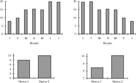
For example, the following pairs of graphs show identical information but look very different. Explain why.
Exercises - misuse of statistics
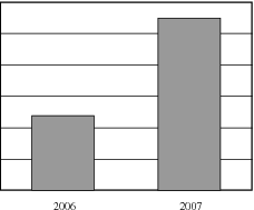
A company has tried to give a visual representation of the increase in their earnings from one year to the next. Does the graph below convince you? Critically analyse the graph.
Click here for the solution
In a study conducted on a busy highway, data was collected about drivers breaking the speed limit and the colour of the car they were driving. The data were collected during a 20 minute time interval during the middle of the day, and are presented in a table and pie chart below.
Conclusions made by a novice based on the data are summarised as follows:
“People driving white cars are more likely to break the speed limit.”
“Drivers in blue and red cars are more likely to stick to the speed limit.”
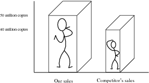
A record label produces a graphic, showing their advantage in sales over their competitors. Identify at least three devices they have used to influence and mislead the readers impression.
Click here for the solution
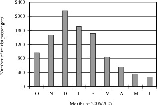
In an effort to discredit their competition, a tour bus company prints the graph shown below. Their claim is that the competitor is losing business. Can you think of a better explanation?
Click here for the solution
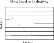
To test a theory, 8 different offices were monitored for noise levels and productivity of the employees in the office. The results are graphed below.
The following statement was then made:
“If an office environment is noisy, this leads to poor productivity.”Explain the flaws in this thinking.
Click here for the solution
Summary of definitions
The mean of a data set,
, denoted by
, is the average of the data values, and is calculated as:
The median is the centre data value in a data set that has been ordered from lowest to highest
The mode is the data value that occurs most often in a data set.
The following presentation summarises what you have learnt in this chapter. Ignore the chapter number and any exercise numbers in the presentation.
Summary
Data types
Collecting data
Samples and populations
Grouping data
TallyFrequency
bins
Graphing data
Bar and compound bar graphsHistograms and frequency polygons
Pie chartsLine and broken line graphs
Summarising data
Central tendency
MeanMedian
ModeDispersion
RangeQuartiles
Inter-quartile rangePercentiles
An engineering company has designed two different types of engines for motorbikes. The two different motorbikes are tested for the time it takes (in seconds) for them to accelerate from 0 km/h to 60 km/h.
Test 1
Test 2
Test 3
Test 4
Test 5
Test 6
Test 7
Test 8
Test 9
Test 10
Average
Bike 1
1.55
1.00
0.92
0.80
1.49
0.71
1.06
0.68
0.87
1.09
Bike 2
0.9
1.0
1.1
1.0
1.0
0.9
0.9
1.0
0.9
1.1
What measure of central tendency should be used for this information?
Calculate the average you chose in the previous question for each motorbike.
Which motorbike would you choose based on this information? Take note of accuracy of the numbers from each set of tests.
A company wanted to evaluate the training programme in its factory. They gave the same task to trained and untrained employees and timed each one in seconds.
Trained
121
137
131
135
130
128
130
126
132
127
129
120
118
125
134
Untrained
135
142
126
148
145
156
152
153
149
145
144
134
139
140
142
Find the medians and quartiles for both sets of data.
Find the Interquartile Range for both sets of data.
In economics, a perfect market refers to a theoretical construct where all participants have perfect information, goods are homogenous, there are no barriers to entry or exit, and prices are determined solely by supply and demand. It's an idealized model used for analysis,
When MP₁ becomes negative, TP start to decline.
Extuples Suppose that the short-run production function of certain cut-flower firm is given by: Q=4KL-0.6K2 - 0.112 •
Where is quantity of cut flower produced, I is labour input and K is fixed capital input (K-5). Determine the average product of lab
Kelo
Extuples Suppose that the short-run production function of certain cut-flower firm is given by: Q=4KL-0.6K2 - 0.112 •
Where is quantity of cut flower produced, I is labour input and K is fixed capital input (K-5). Determine the average product of labour (APL) and marginal product of labour (MPL)
Quantity demanded refers to the specific amount of a good or service that consumers are willing and able to purchase at a give price and within a specific time period. Demand, on the other hand, is a broader concept that encompasses the entire relationship between price and quantity demanded
Ezea
ok
Shukri
how do you save a country economic situation when it's falling apart
Economic growth as an increase in the production and consumption of goods and services within an economy.but
Economic development as a broader concept that encompasses not only economic growth but also social & human well being.
Shukri
production function means
Jabir
What do you think is more important to focus on when considering inequality ?
sir...I just want to ask one question... Define the term contract curve? if you are free please help me to find this answer 🙏
Asui
it is a curve that we get after connecting the pareto optimal combinations of two consumers after their mutually beneficial trade offs
Awais
thank you so much 👍 sir
Asui
In economics, the contract curve refers to the set of points in an Edgeworth box diagram where both parties involved in a trade cannot be made better off without making one of them worse off. It represents the Pareto efficient allocations of goods between two individuals or entities, where neither p
Cornelius
In economics, the contract curve refers to the set of points in an Edgeworth box diagram where both parties involved in a trade cannot be made better off without making one of them worse off. It represents the Pareto efficient allocations of goods between two individuals or entities,
Cornelius
Suppose a consumer consuming two commodities X and Y has
The following utility function u=X0.4 Y0.6. If the price of the X and Y are 2 and 3 respectively and income Constraint is birr 50.
A,Calculate quantities of x and y which maximize utility.
B,Calculate value of Lagrange multiplier.
C,Calculate quantities of X and Y consumed with a given price.
D,alculate optimum level of output .
the market for lemon has 10 potential consumers, each having an individual demand curve p=101-10Qi, where p is price in dollar's per cup and Qi is the number of cups demanded per week by the i th consumer.Find the market demand curve using algebra. Draw an individual demand curve and the market dema
suppose the production function is given by ( L, K)=L¼K¾.assuming capital is fixed find APL and MPL. consider the following short run production function:Q=6L²-0.4L³ a) find the value of L that maximizes output b)find the value of L that maximizes marginal product