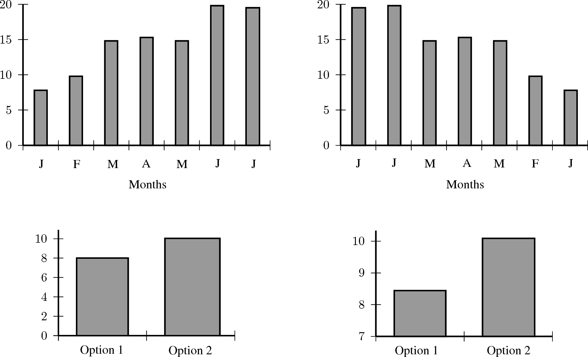
For example, the following pairs of graphs show identical information but look very different. Explain why.
Exercises - misuse of statistics
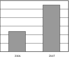
A company has tried to give a visual representation of the increase in their earnings from one year to the next. Does the graph below convince you? Critically analyse the graph.
In a study conducted on a busy highway, data was collected about drivers breaking the speed limit and the colour of the car they were driving. The data were collected during a 20 minute time interval during the middle of the day, and are presented in a table and pie chart below.
Conclusions made by a novice based on the data are summarised as follows:
“People driving white cars are more likely to break the speed limit.”
“Drivers in blue and red cars are more likely to stick to the speed limit.”
Do you agree with these conclusions? Explain.
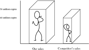
A record label produces a graphic, showing their advantage in sales over their competitors. Identify at least three devices they have used to influence and mislead the readers impression.
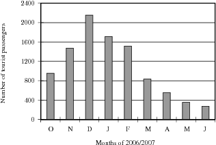
In an effort to discredit their competition, a tour bus company prints the graph shown below. Their claim is that the competitor is losing business. Can you think of a better explanation?
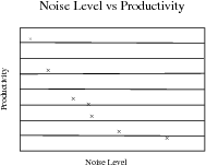
To test a theory, 8 different offices were monitored for noise levels and productivity of the employees in the office. The results are graphed below.
The following statement was then made:
“If an office environment is noisy, this leads to poor productivity.”Explain the flaws in this thinking.
Click here for the solution
End of chapter summary
Data types can be divided into primary and secondary data. Primary data may be further divided into qualitative and quantitative data.
We use the following as measures of central tendency:
The mean of a data set,
, denoted by
, is the average of the data values, and is calculated as:
The median is the centre data value in a data set that has been ordered from lowest to highest
The mode is the data value that occurs most often in a data set.
The following are measures of dispersion:
The range of a data set is the difference between the lowest value and the highest value in the set.
Quartiles are the three data values that divide an ordered data set into four groups containing equal numbers of data values. The median is the second quartile.
Percentiles are the 99 data values that divide a data set into 100 groups.
The inter quartile range is a measure which provides information about the spread of a data set, and is calculated by subtracting the first quartile from the third quartile, giving the range of the middle half of the data set, trimming off the lowest and highest quarters, i.e.
. Half of this value is the semi-interquartile range.
The five number summary is a way to summarise data. A box and whisker plot is a graphical representation of the five number summary.
Random errors are found in all sets of data and arise from estimating data values. Bias or systematic error occurs when you consistently under or over estimate data values.
You must always consider the data and the statistics that summarise the data
Exercises
Calculate the mean, median, and mode of Data Set 3.
The tallest 7 trees in a park have heights in metres of 41, 60, 47, 42, 44, 42, and 47. Find the median of their heights.
The students in Bjorn's class have the following ages: 5, 6, 7, 5, 4, 6, 6, 6, 7, 4. Find the mode of their ages.
An engineering company has designed two different types of engines for motorbikes. The two different motorbikes are tested for the time it takes (in seconds) for them to accelerate from 0 km/h to 60 km/h.
Test 1
Test 2
Test 3
Test 4
Test 5
Test 6
Test 7
Test 8
Test 9
Test 10
Average
Bike 1
1.55
1.00
0.92
0.80
1.49
0.71
1.06
0.68
0.87
1.09
Bike 2
0.9
1.0
1.1
1.0
1.0
0.9
0.9
1.0
0.9
1.1
What measure of central tendency should be used for this information?
Calculate the average you chose in the previous question for each motorbike.
Which motorbike would you choose based on this information? Take note of accuracy of the numbers from each set of tests.
The heights of 40 learners are given below.
154
140
145
159
150
132
149
150
138
152
141
132
169
173
139
161
163
156
157
171
168
166
151
152
132
142
170
162
146
152
142
150
161
138
170
131
145
146
147
160
Set up a frequency table using 6 intervals.
Calculate the approximate mean.
Determine the mode.
How many learners are taller than your approximate average in (b)?
In a traffic survey, a random sample of 50 motorists were asked the distance they drove to work daily. This information is shown in the table below.
Distance in km
1-5
6-10
11-15
16-20
21-25
26-30
31-35
36-40
41-45
Frequency
4
5
9
10
7
8
3
2
2
Find the approximate mean.
What percentage of samples drove
less than 16 km?
more than 30 km?
between 16 km and 30 km daily?
A company wanted to evaluate the training programme in its factory. They gave the same task to trained and untrained employees and timed each one in seconds.
Trained
121
137
131
135
130
128
130
126
132
127
129
120
118
125
134
Untrained
135
142
126
148
145
156
152
153
149
145
144
134
139
140
142
Find the medians and quartiles for both sets of data.
Find the Interquartile Range for both sets of data.
Comment on the results.
A small firm employs nine people. The annual salaries of the employers are:
R600 000
R250 000
R200 000
R120 000
R100 000
R100 000
R100 000
R90 000
R80 000
Find the mean of these salaries.
Find the mode.
Find the median.
Of these three figures, which would you use for negotiating salary increases if you were a trade union official? Why?
The marks for a particular class test are listed here:
67
58
91
67
58
82
71
51
60
84
31
67
96
64
78
71
87
78
89
38
69
62
60
73
60
87
71
49
Complete the frequency table using the given class intervals.