<< Chapter < Page
  Digital signal processing - dsp     Page 8 / 10
Chapter >> Page >

The peak in the fifth plot

Similarly, the frequency of the sinusoid for the fifth plot was 1.75 cycles per second. The peak for this sinusoid should have appeared 0.75 cycles persecond above the folding frequency, but appeared instead 0.75 cycles per second below the folding frequency. In other words, the spectrum folded around thefolding frequency so that this peak appeared below the folding frequency.

I am going to show you two more views of the spectra of these sinusoids to help you better understand the folding phenomena.

Back to the case with no problems

Let's go back and examine another view of the case that has no sampling problems. This view is shown in Figure 9 .

Figure 9. Spectral analyses of five sinusoids with no sampling problems.
missing image

Sampled at four samples per second

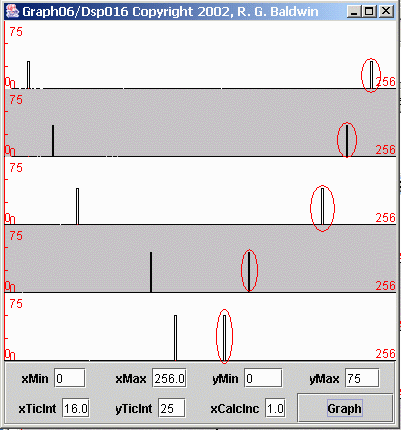
This is the case where all five sinusoids are sampled at a sampling frequency of four samples per second, resulting in a folding frequency of two cycles persecond. If you compare Figure 9 with Figure 7 , you will see that the left half of Figure 9 is very similar to Figure 7 .

Figure 9 Shows twice the frequency range

In Figure 7 , the spectral data was computed and displayed from zero frequency on the left to the folding frequency (two cycles per second) on the right. In Figure 9 , the spectral data was computed and displayed from zero frequency on the left to the sampling frequency (four cycles per second) on the right.

Thus, the total frequency range for Figure 9 is twice the frequency range for Figure 7 .

Folding frequency at the center

In Figure 9 , the folding frequency is exactly in the center of each plot. In other words, the center of the plots in Figure 9 corresponds to the right edge of the plots in Figure 7 . Everything to the left of center in Figure 9 corresponds to the plots in Figure 7 . The material to the right of center in Figure 9 was not shown in Figure 7 .

Why is it called the folding frequency?

Hopefully the display in Figure 9 will explain why the frequency that is half the sampling frequency is called the folding frequency. The computed spectrumfolds around that frequency. Everything to the right of the folding frequency is a mirror image of everything to the left of the folding frequency.

Peaks below folding frequency are valid

All the peaks to the left of center in Figure 9 are valid spectral peaks associated with the corresponding sinusoids. However, all the peaks to the rightof center, which I marked with red ovals, are artifacts of the sampling process. Those peaks do not exist in the true spectrum of the original raw data. Theywere created by the sampling process.

Normally don't compute the mirror image

Normally we don't worry about this mirror image above the folding frequency when doing spectral analyses. We know it is there and we simply ignore it.

In fact, for reasons of economy, when doing spectral analyses using discrete Fourier transforms, we usually don't even compute the spectrum at frequenciesabove the folding frequency. Since it is always a mirror image of the spectrum below the folding frequency, we know what it looks like without even computingit.

Questions & Answers

What is inflation
Bright Reply
a general and ongoing rise in the level of prices in an economy
AI-Robot
What are the factors that affect demand for a commodity
Florence Reply
differentiate between demand and supply giving examples
Lambiv Reply
differentiated between demand and supply using examples
Lambiv
what is labour ?
Lambiv
how will I do?
Venny Reply
how is the graph works?I don't fully understand
Rezat Reply
information
Eliyee
devaluation
Eliyee
t
WARKISA
hi guys good evening to all
Lambiv
multiple choice question
Aster Reply
appreciation
Eliyee
explain perfect market
Lindiwe Reply
In economics, a perfect market refers to a theoretical construct where all participants have perfect information, goods are homogenous, there are no barriers to entry or exit, and prices are determined solely by supply and demand. It's an idealized model used for analysis,
Ezea
What is ceteris paribus?
Shukri Reply
other things being equal
AI-Robot
When MP₁ becomes negative, TP start to decline. Extuples Suppose that the short-run production function of certain cut-flower firm is given by: Q=4KL-0.6K2 - 0.112 • Where is quantity of cut flower produced, I is labour input and K is fixed capital input (K-5). Determine the average product of lab
Kelo
Extuples Suppose that the short-run production function of certain cut-flower firm is given by: Q=4KL-0.6K2 - 0.112 • Where is quantity of cut flower produced, I is labour input and K is fixed capital input (K-5). Determine the average product of labour (APL) and marginal product of labour (MPL)
Kelo
yes,thank you
Shukri
Can I ask you other question?
Shukri
what is monopoly mean?
Habtamu Reply
What is different between quantity demand and demand?
Shukri Reply
Quantity demanded refers to the specific amount of a good or service that consumers are willing and able to purchase at a give price and within a specific time period. Demand, on the other hand, is a broader concept that encompasses the entire relationship between price and quantity demanded
Ezea
ok
Shukri
how do you save a country economic situation when it's falling apart
Lilia Reply
what is the difference between economic growth and development
Fiker Reply
Economic growth as an increase in the production and consumption of goods and services within an economy.but Economic development as a broader concept that encompasses not only economic growth but also social & human well being.
Shukri
production function means
Jabir
What do you think is more important to focus on when considering inequality ?
Abdisa Reply
any question about economics?
Awais Reply
sir...I just want to ask one question... Define the term contract curve? if you are free please help me to find this answer 🙏
Asui
it is a curve that we get after connecting the pareto optimal combinations of two consumers after their mutually beneficial trade offs
Awais
thank you so much 👍 sir
Asui
In economics, the contract curve refers to the set of points in an Edgeworth box diagram where both parties involved in a trade cannot be made better off without making one of them worse off. It represents the Pareto efficient allocations of goods between two individuals or entities, where neither p
Cornelius
In economics, the contract curve refers to the set of points in an Edgeworth box diagram where both parties involved in a trade cannot be made better off without making one of them worse off. It represents the Pareto efficient allocations of goods between two individuals or entities,
Cornelius
Suppose a consumer consuming two commodities X and Y has The following utility function u=X0.4 Y0.6. If the price of the X and Y are 2 and 3 respectively and income Constraint is birr 50. A,Calculate quantities of x and y which maximize utility. B,Calculate value of Lagrange multiplier. C,Calculate quantities of X and Y consumed with a given price. D,alculate optimum level of output .
Feyisa Reply
Answer
Feyisa
c
Jabir
Got questions? Join the online conversation and get instant answers!
Jobilize.com Reply

Get Jobilize Job Search Mobile App in your pocket Now!

Get it on Google Play Download on the App Store Now


Source:  OpenStax, Digital signal processing - dsp. OpenStax CNX. Jan 06, 2016 Download for free at https://legacy.cnx.org/content/col11642/1.38
Google Play and the Google Play logo are trademarks of Google Inc.

Notification Switch

Would you like to follow the 'Digital signal processing - dsp' conversation and receive update notifications?

Ask